My role: Art Director and Lead Designer
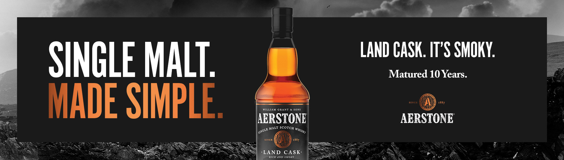
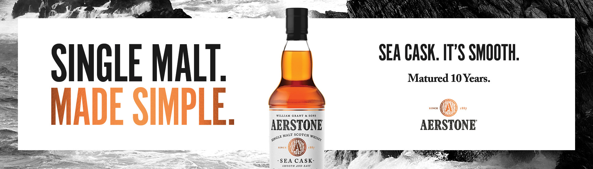
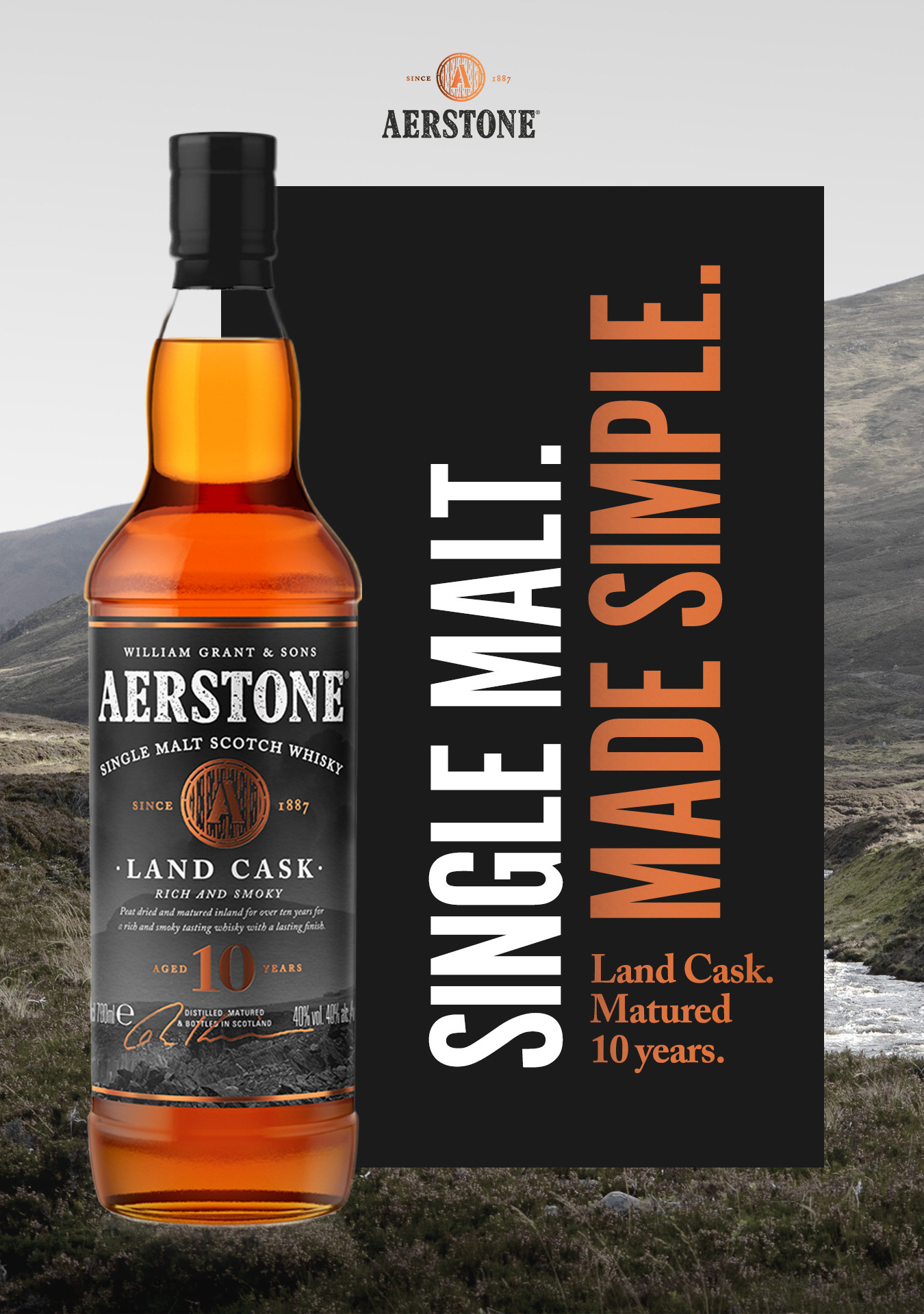
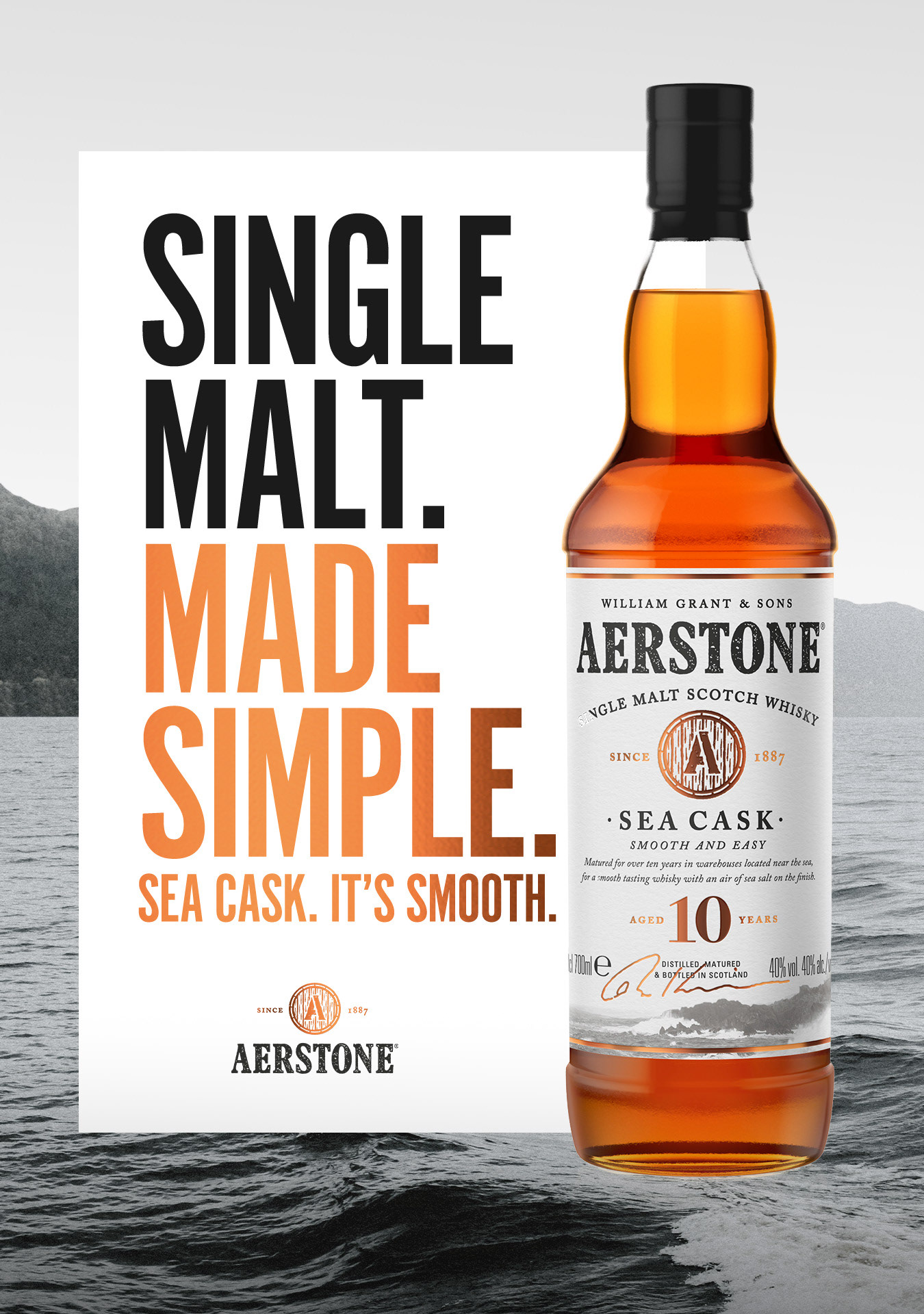
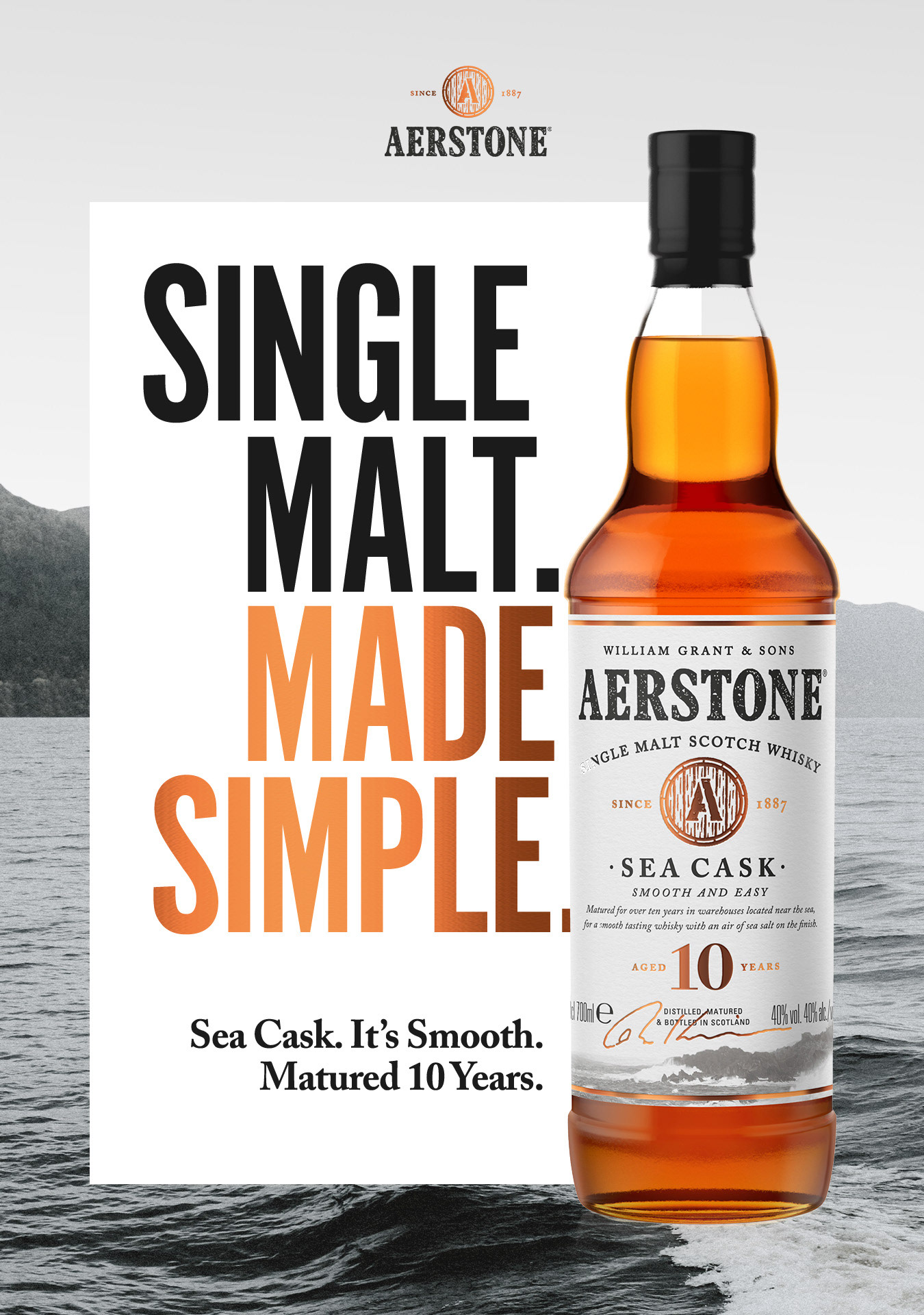
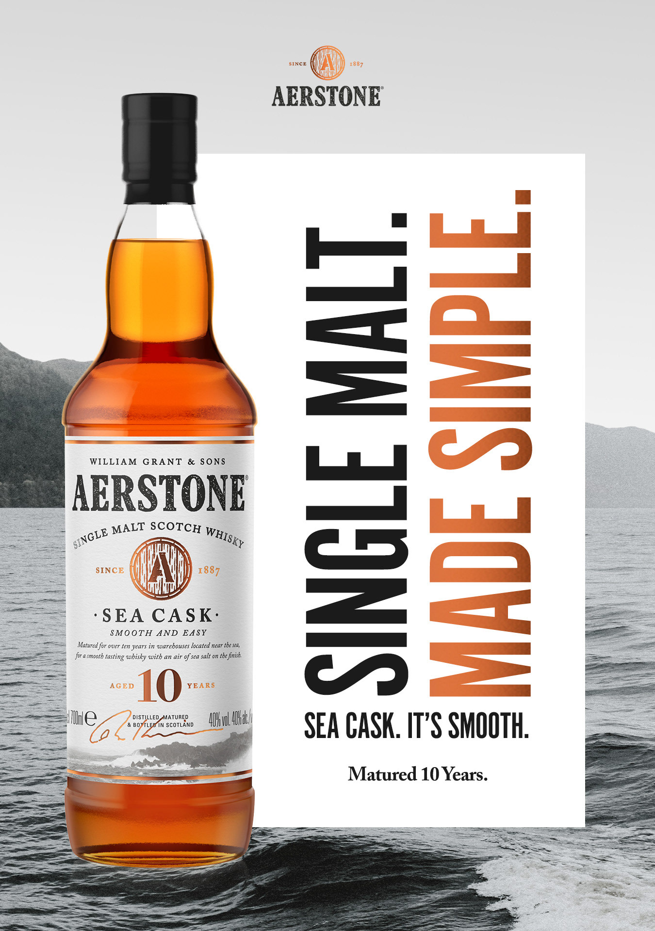
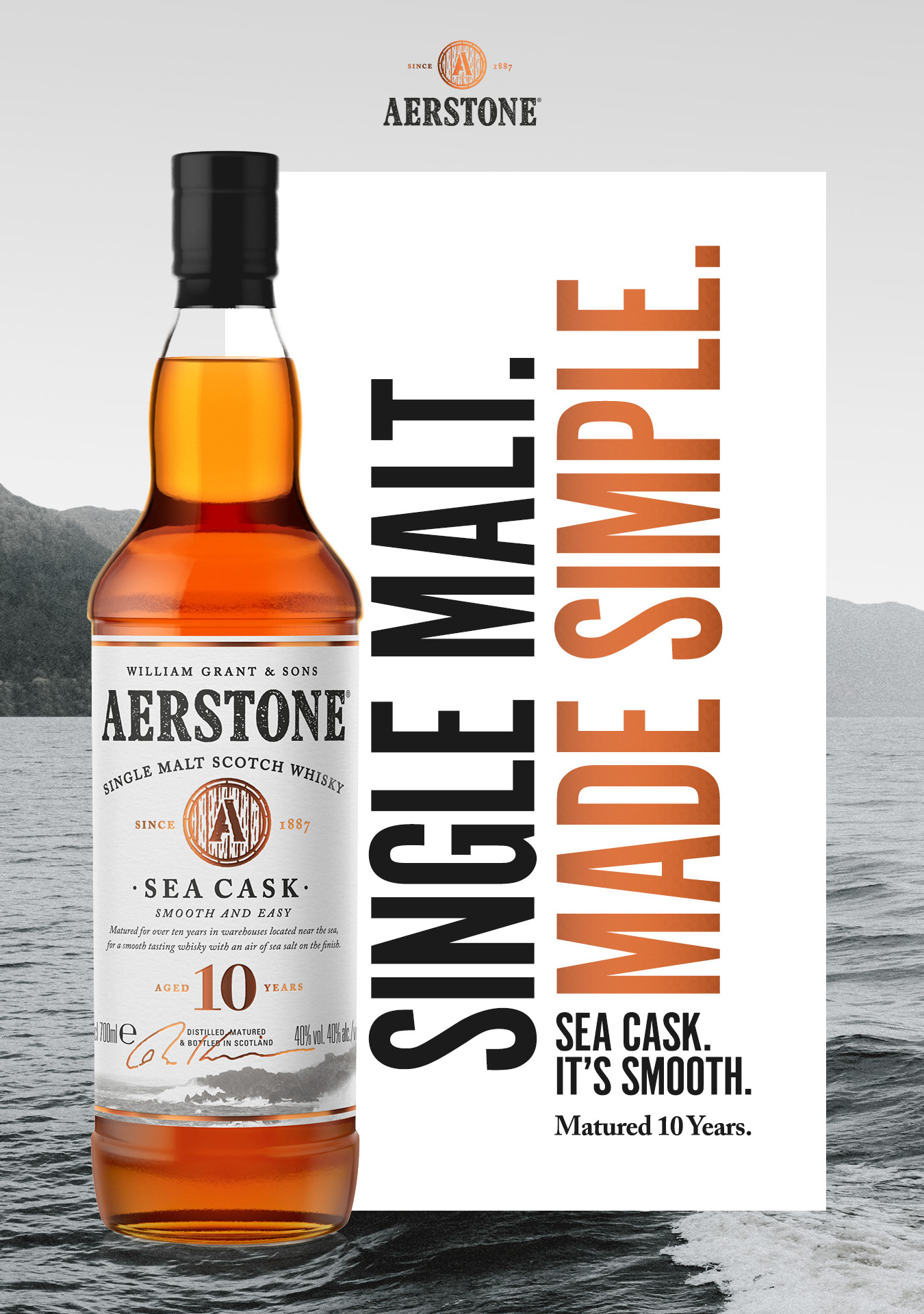
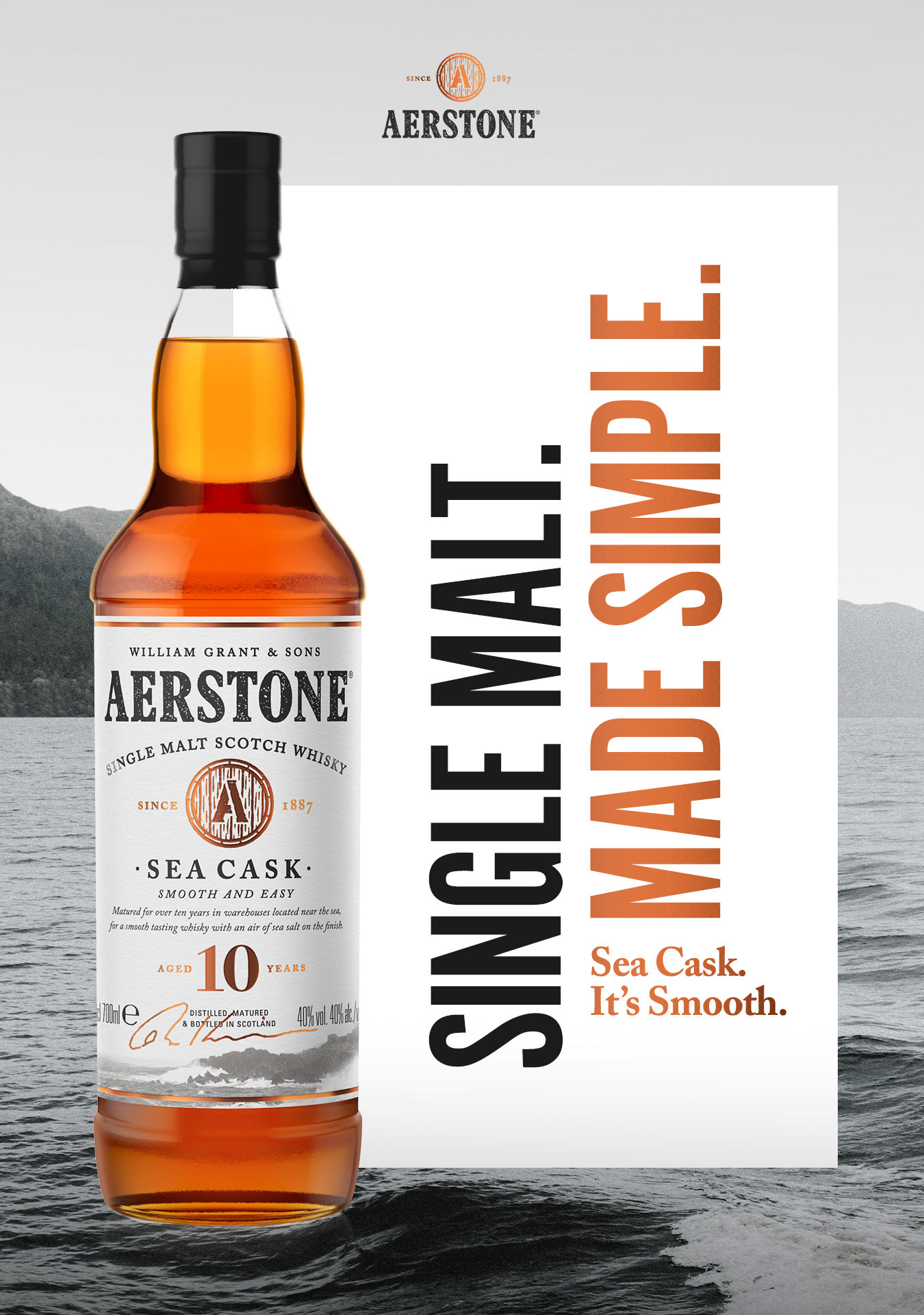
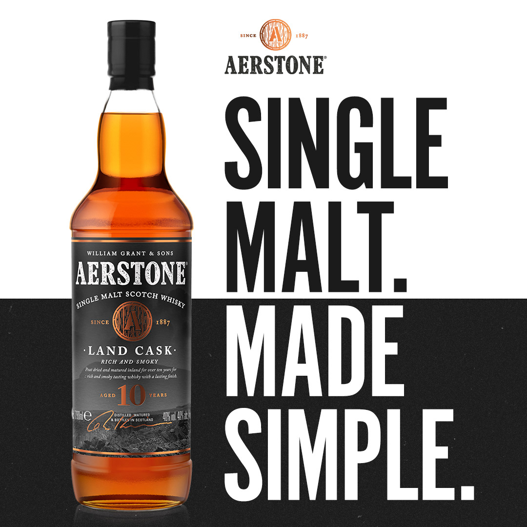
Having worked with Aerstone for years, we were approached by them to design a Comms refocus based on their existing brand guidelines and aligning with the global campaign materials, but with a new strap line - "SINGLE MALT MADE SIMPLE"
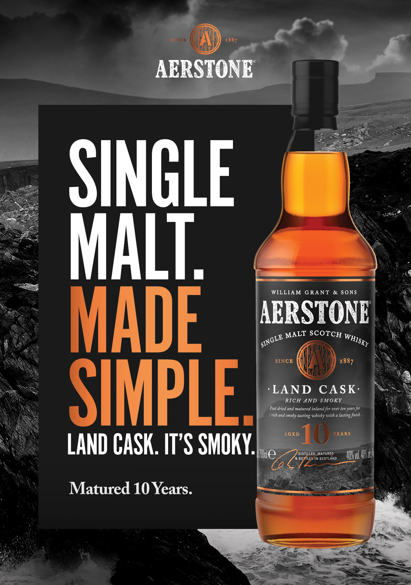
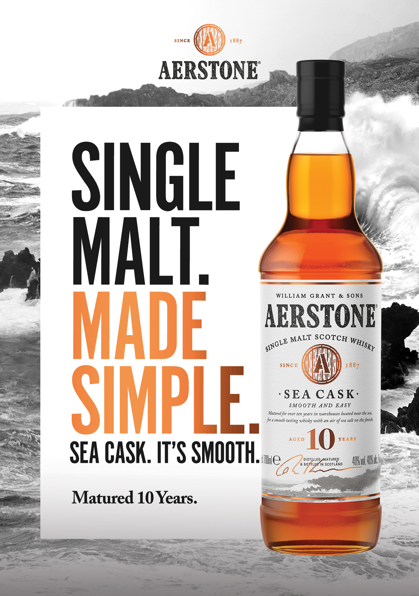
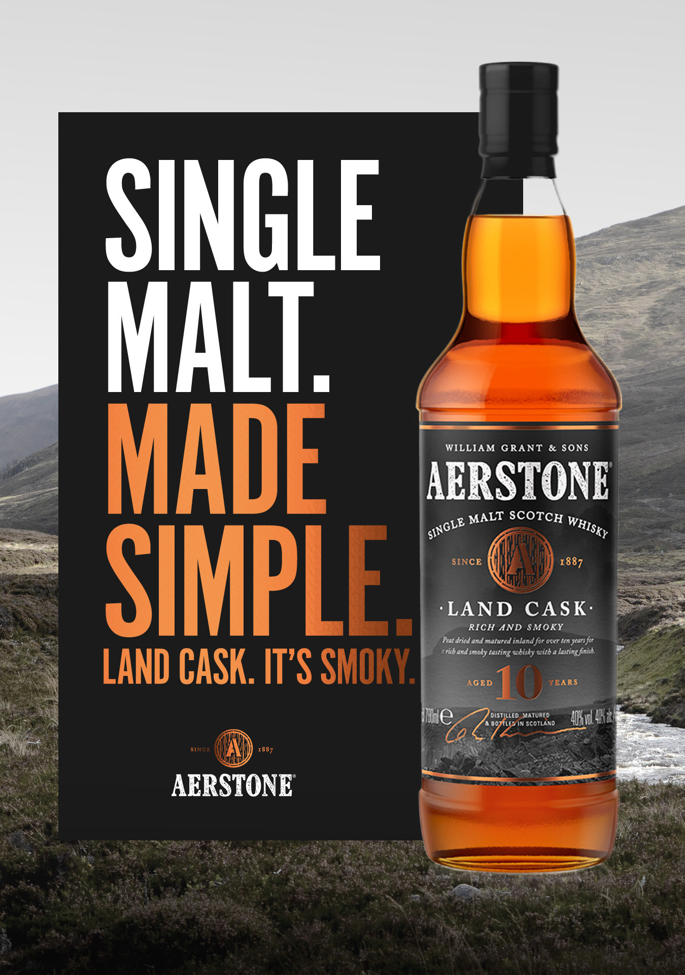
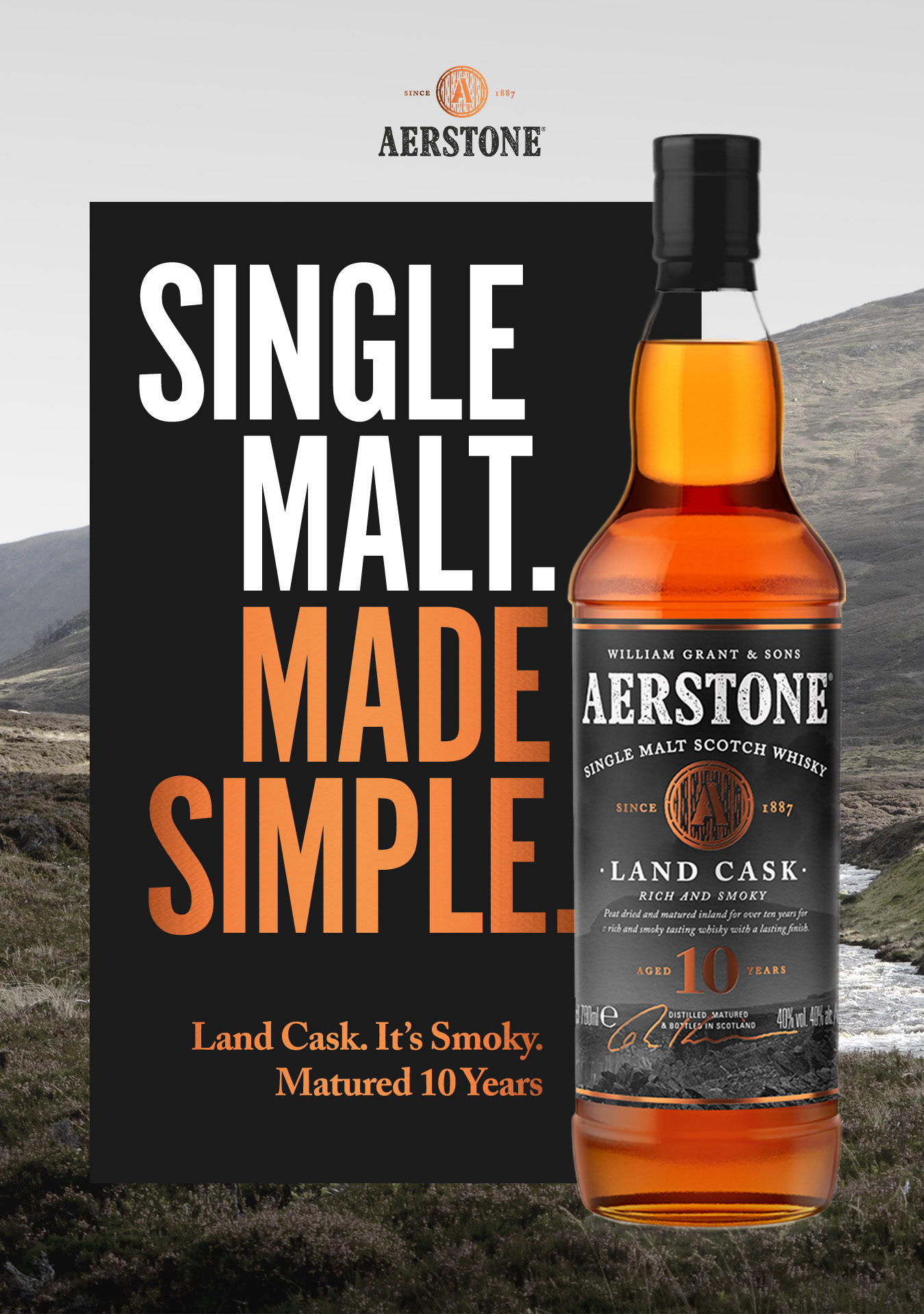
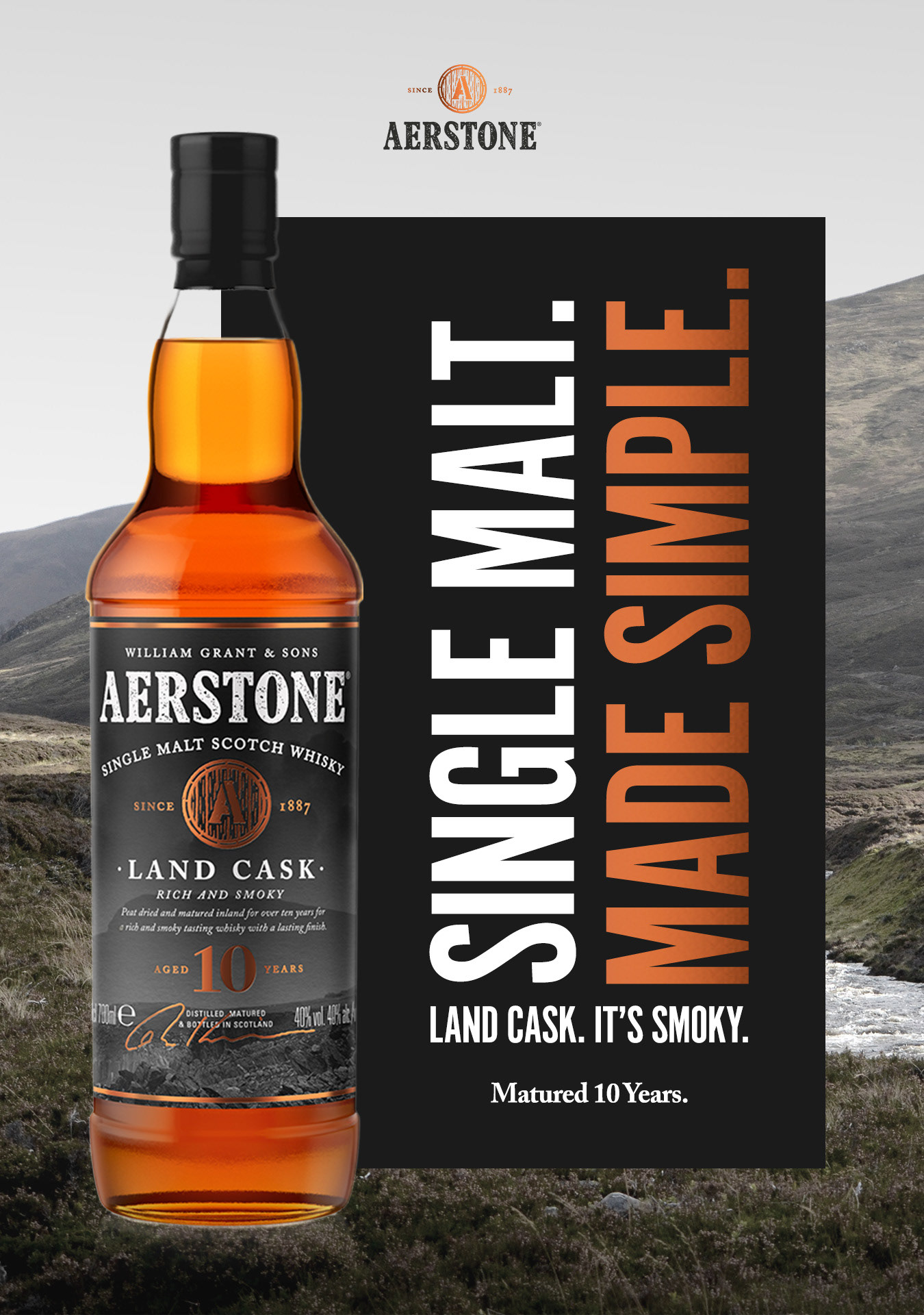
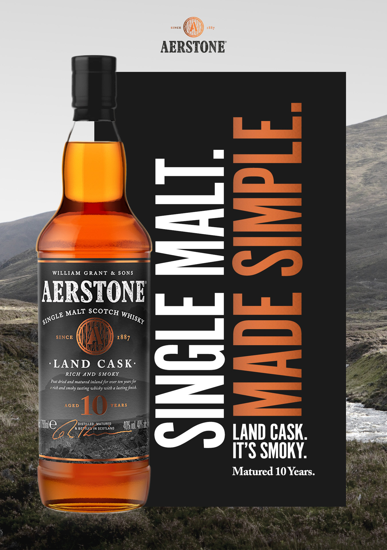
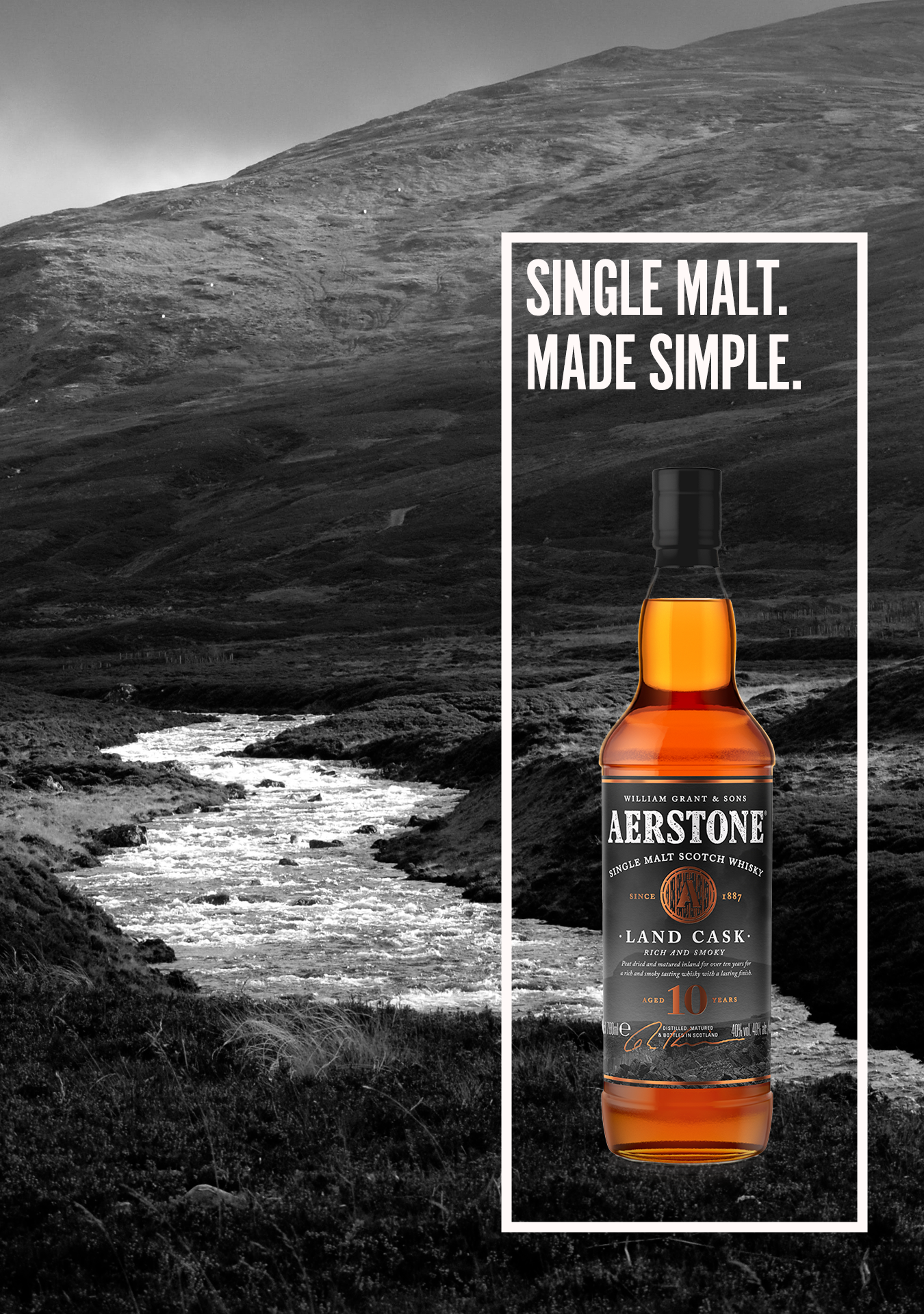
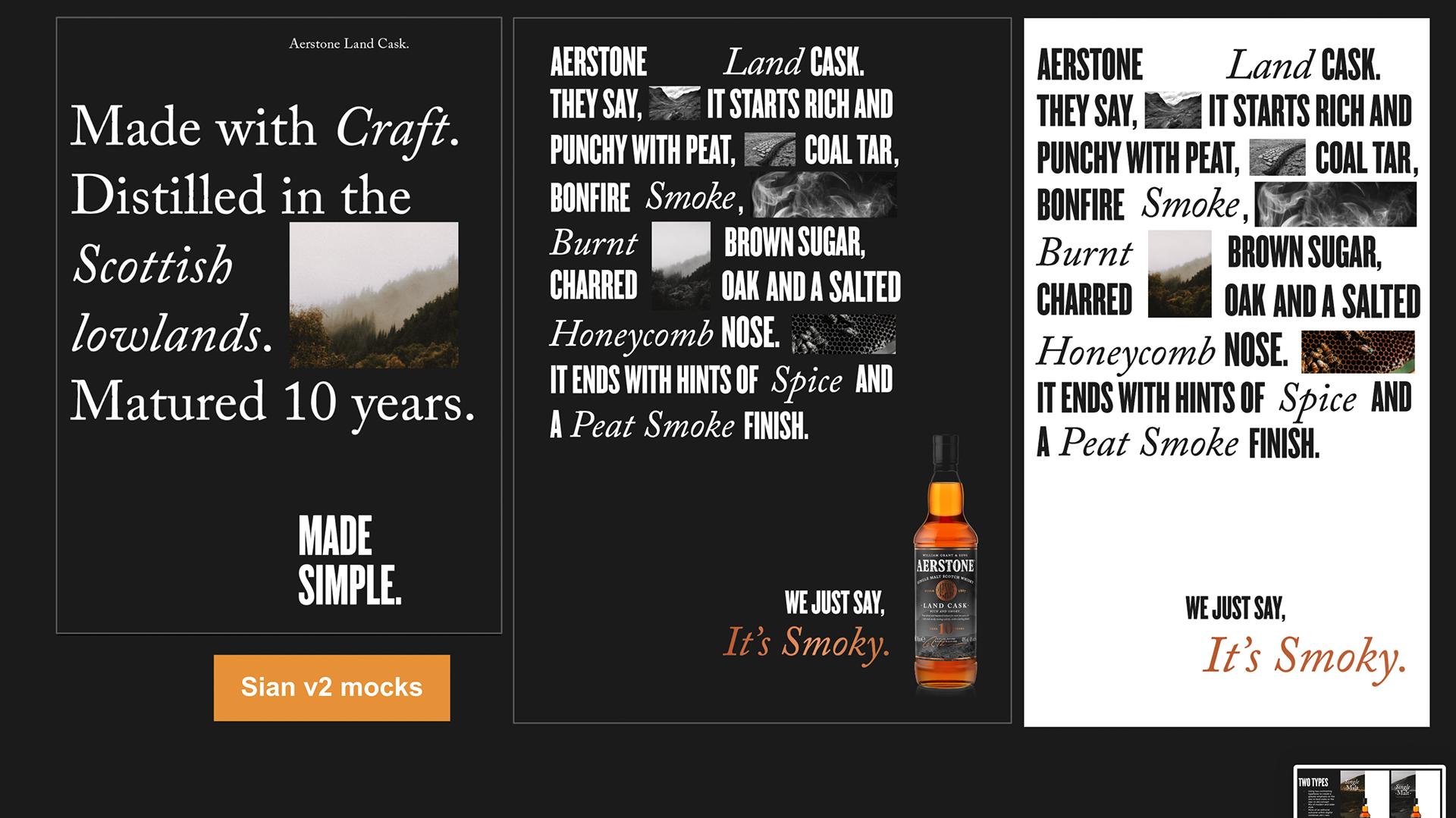
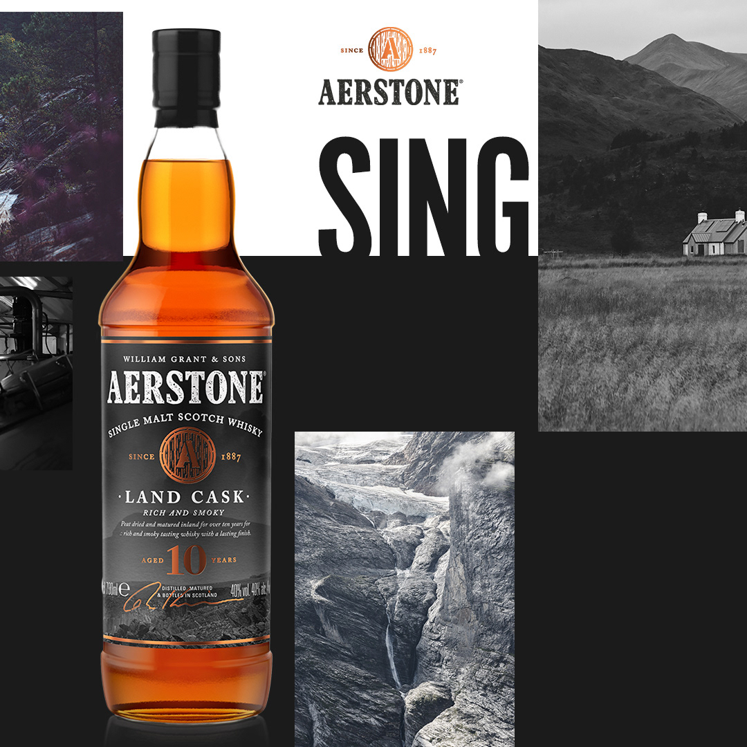
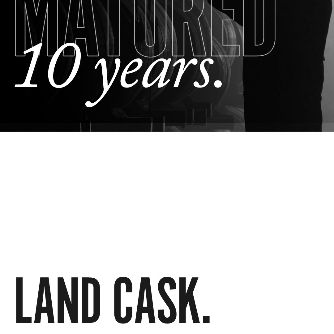
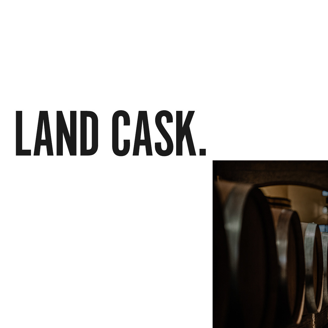
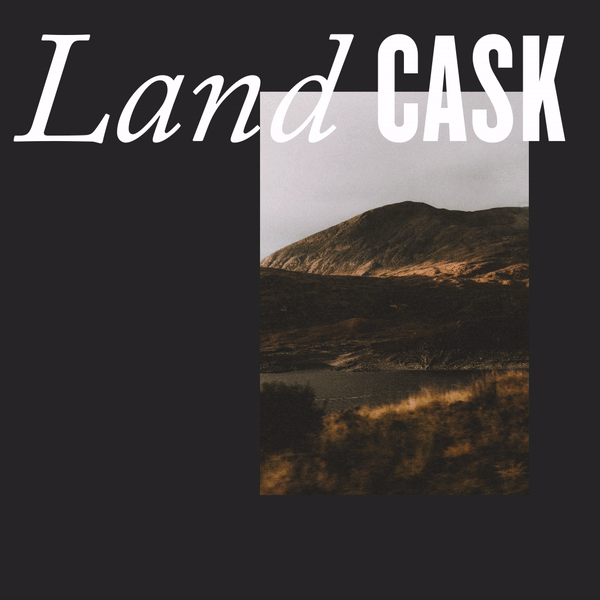
Final Key Visual designs
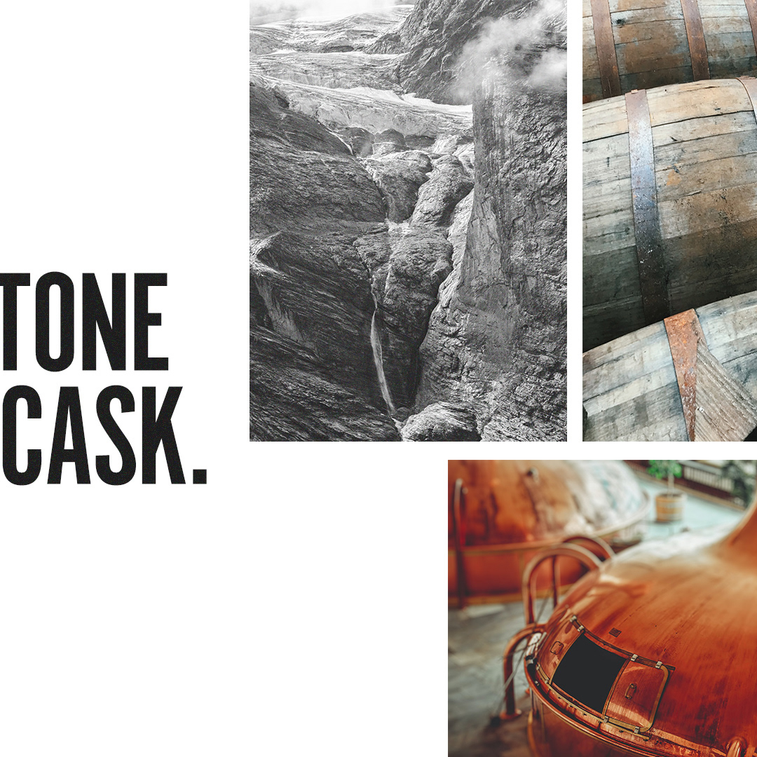
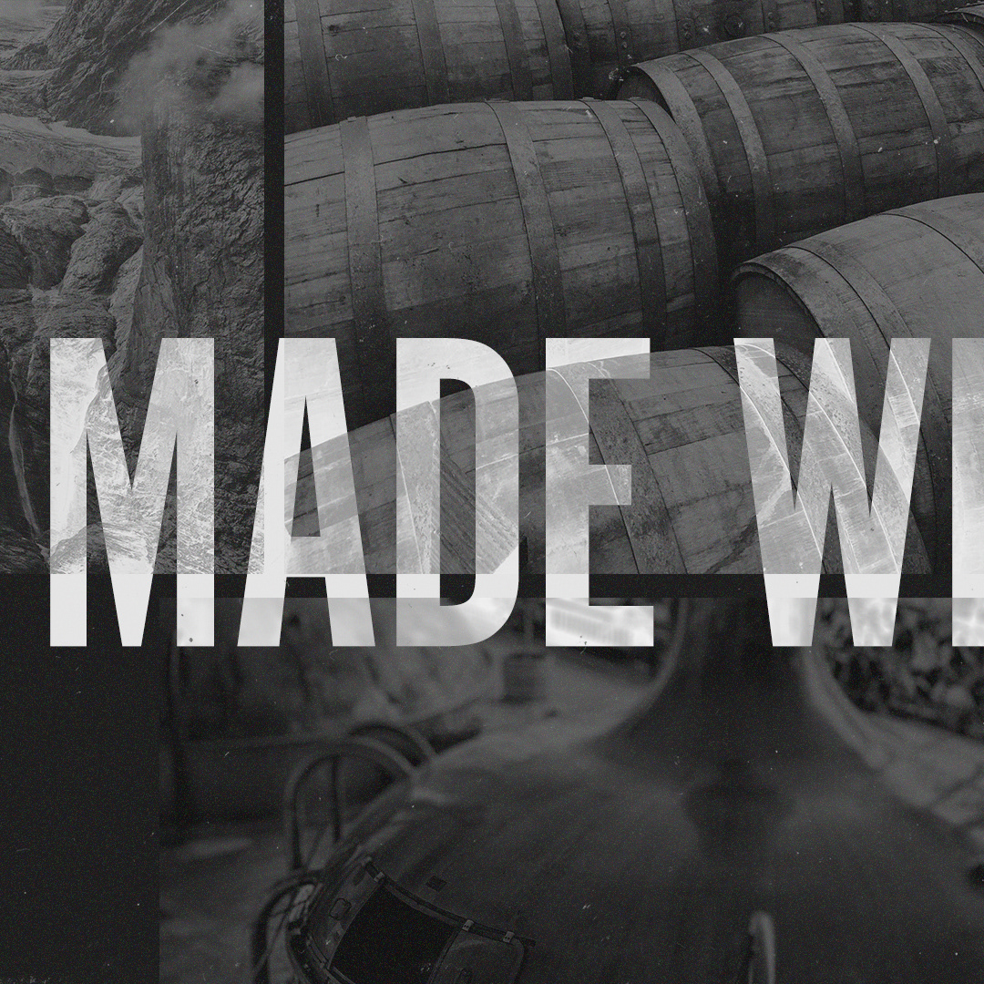
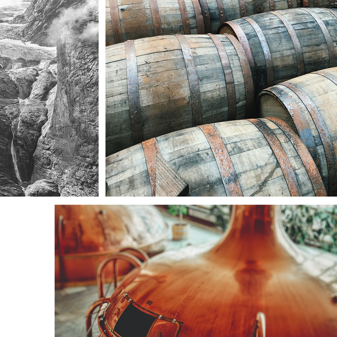
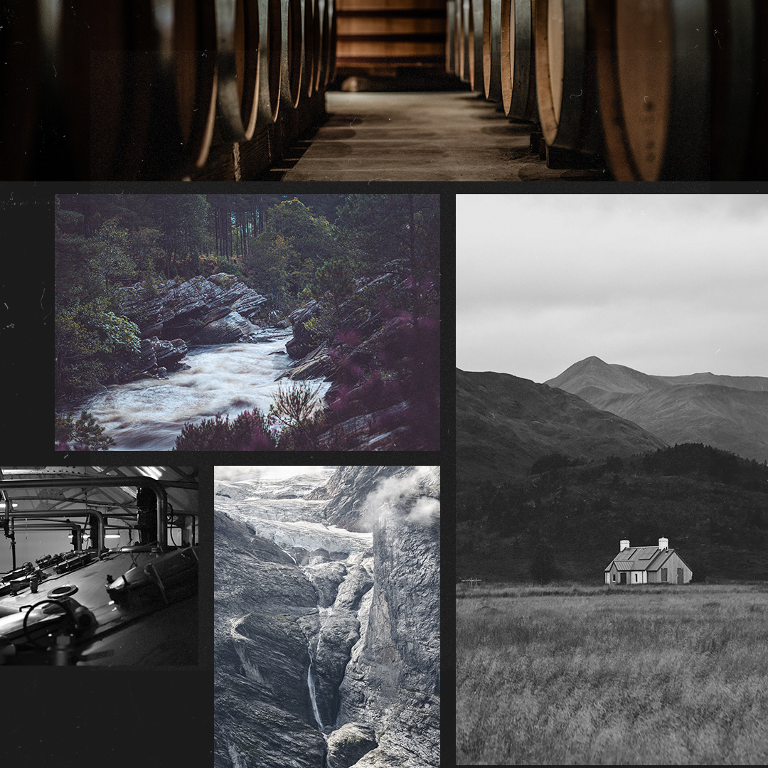
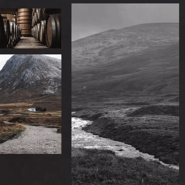
Exploration concepting
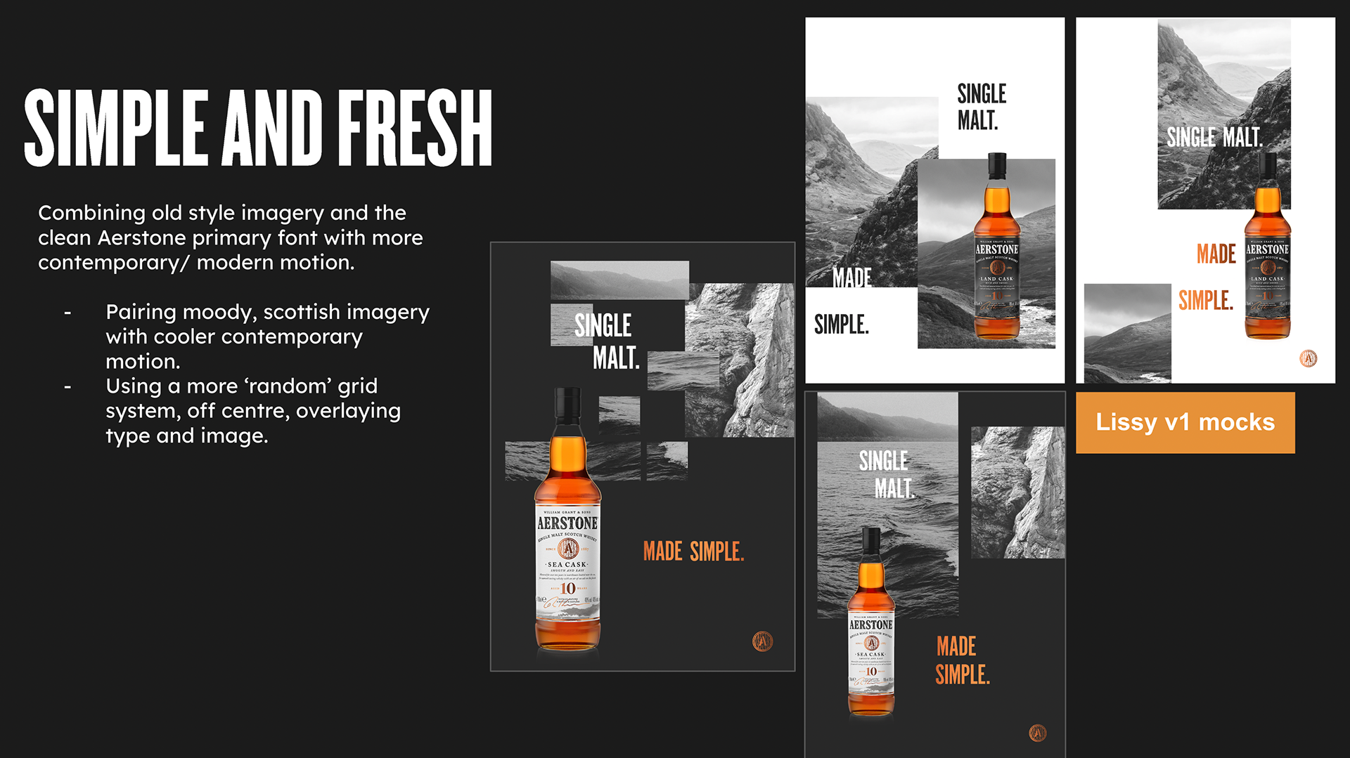
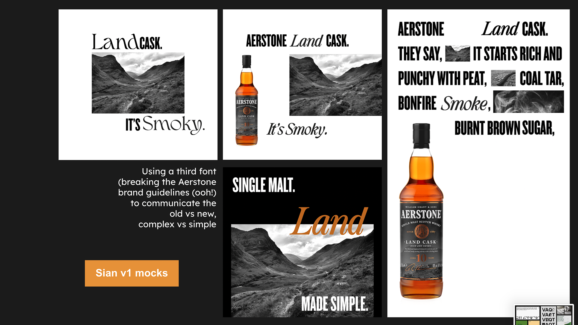
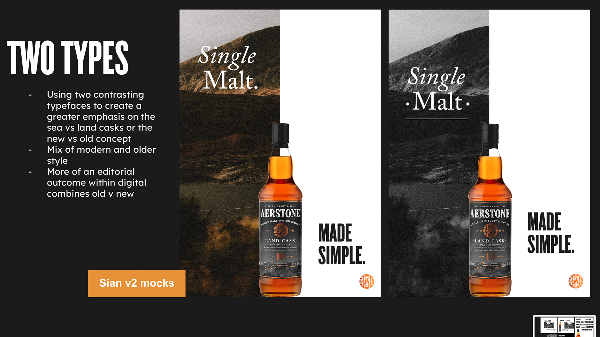
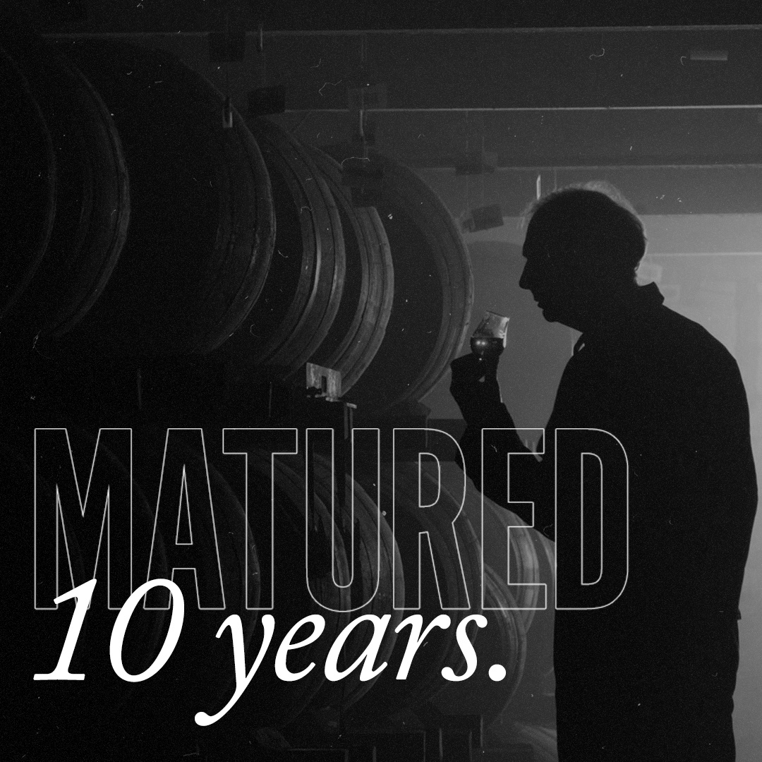
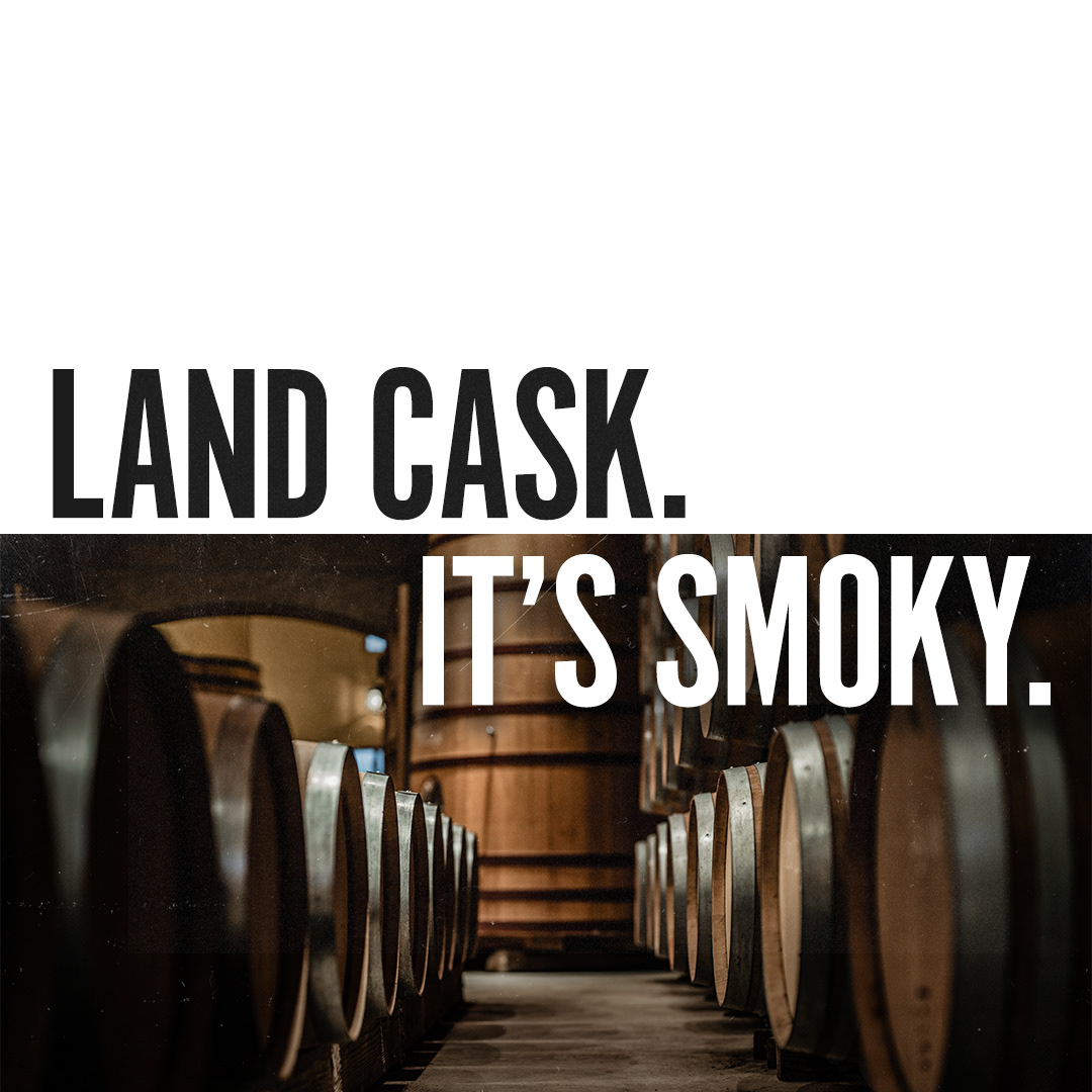
During exploration I wanted to visually demonstrate this notion of 'made simple' by 'reframing' the complex, and allowing the eye to focus solely on the product, branding and campaign strap line. I used different design elements to draw the eye away from the complex Scottish landscape photography and allow the product to take center stage.
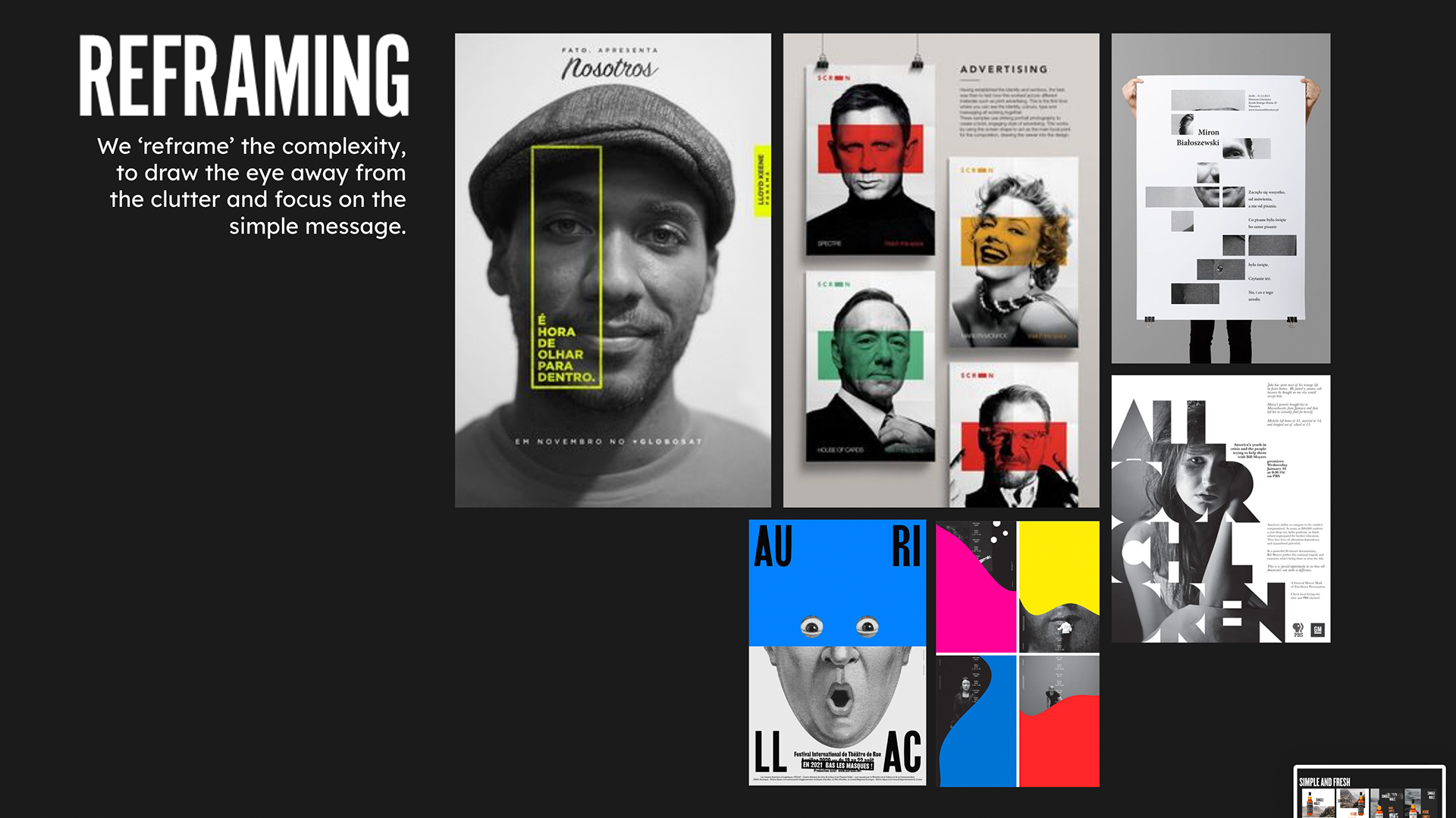
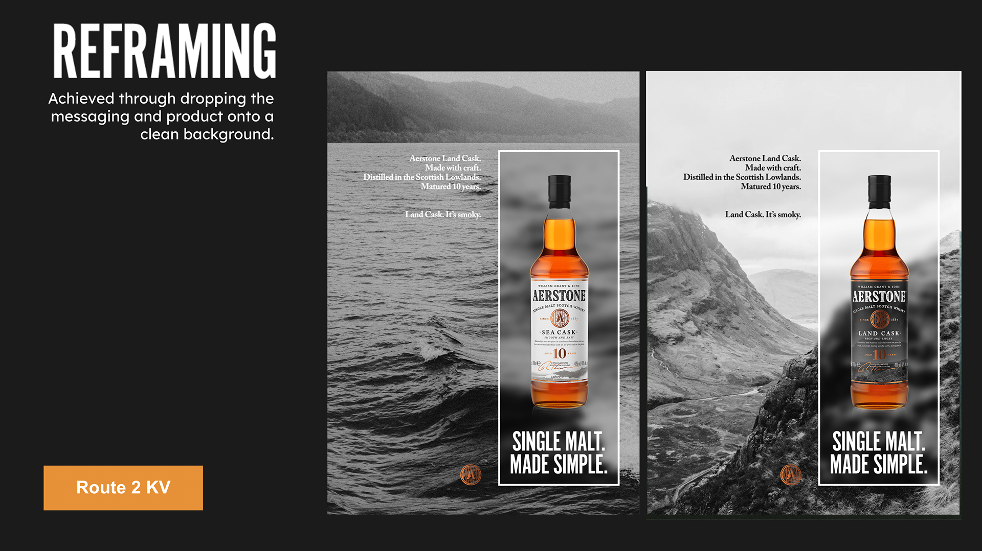
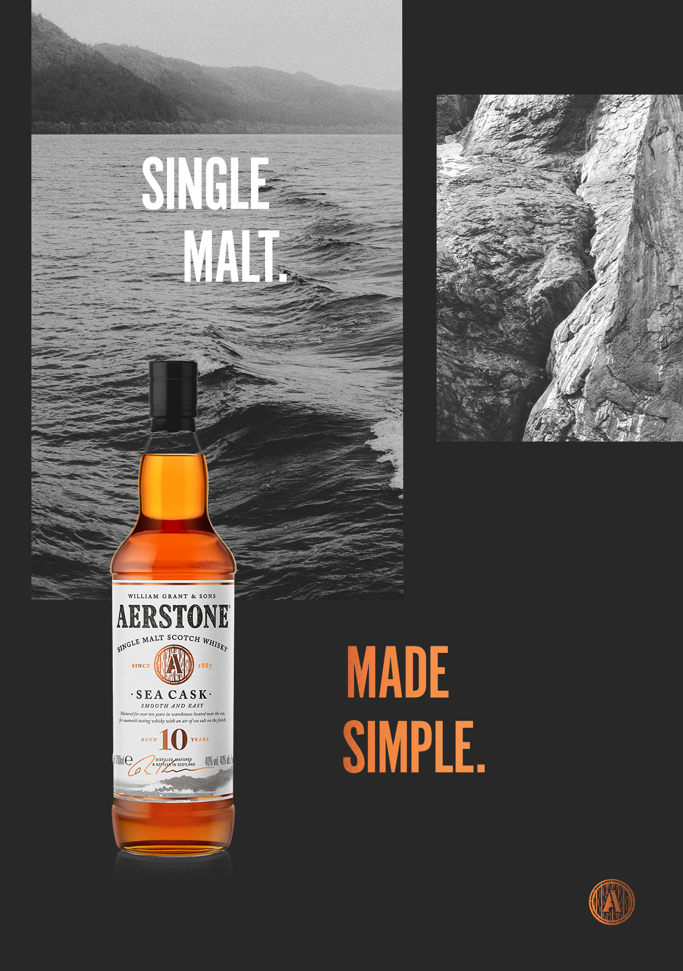
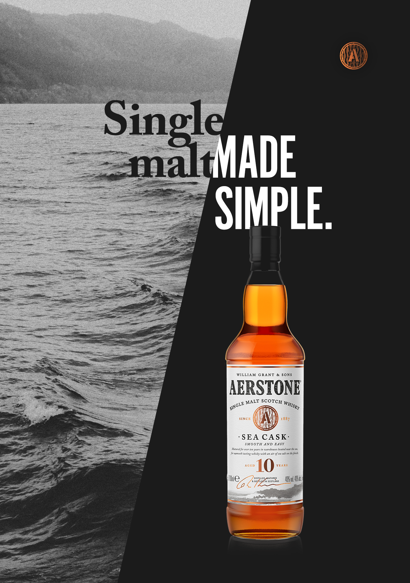
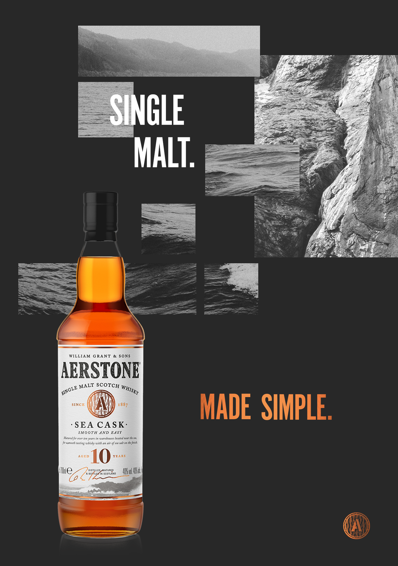
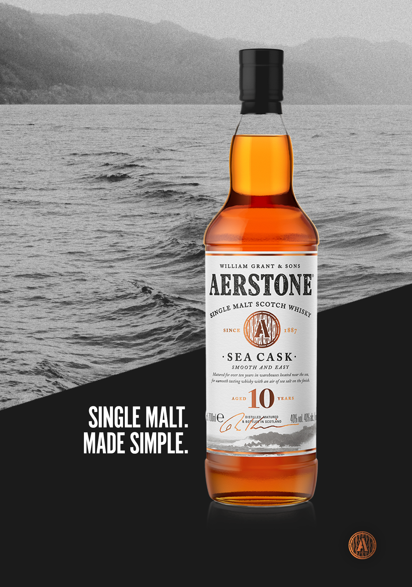
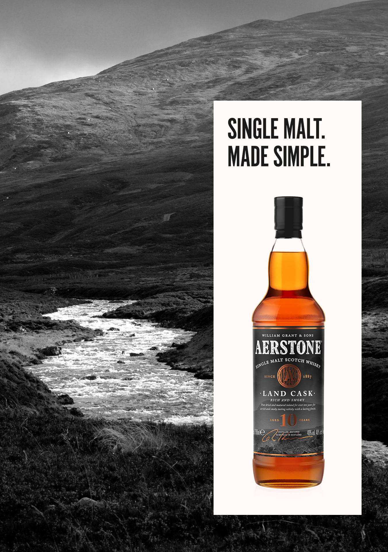
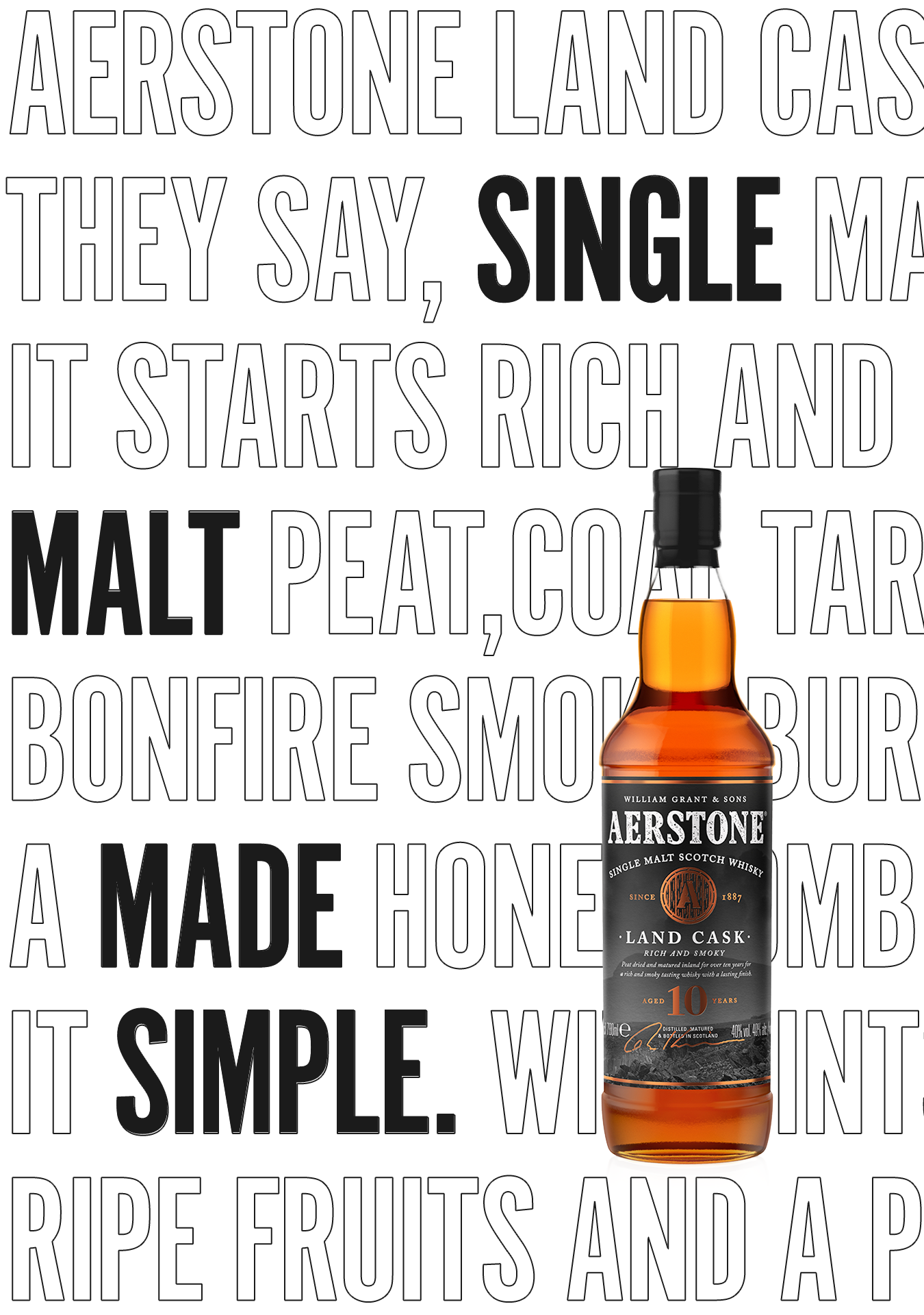
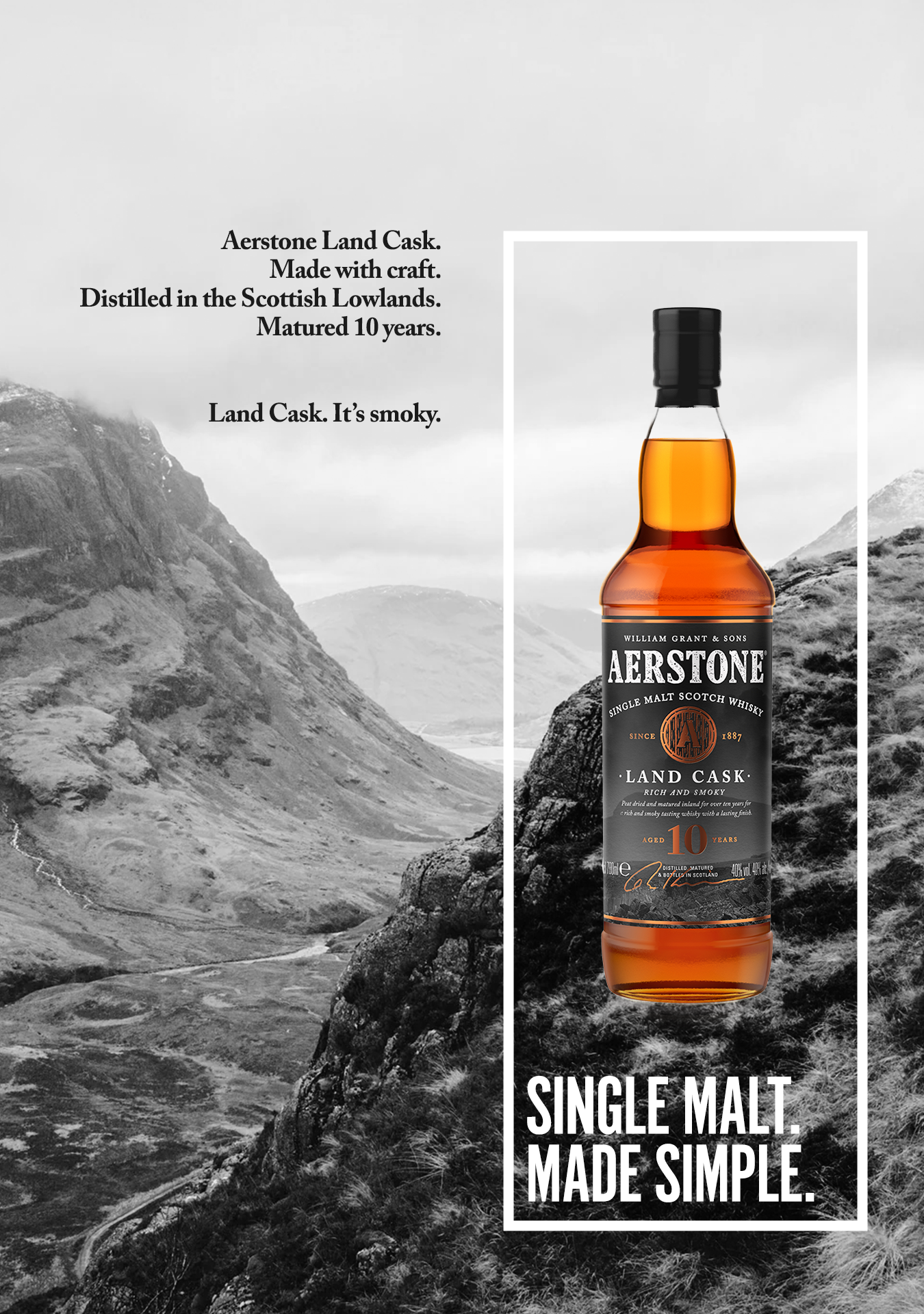
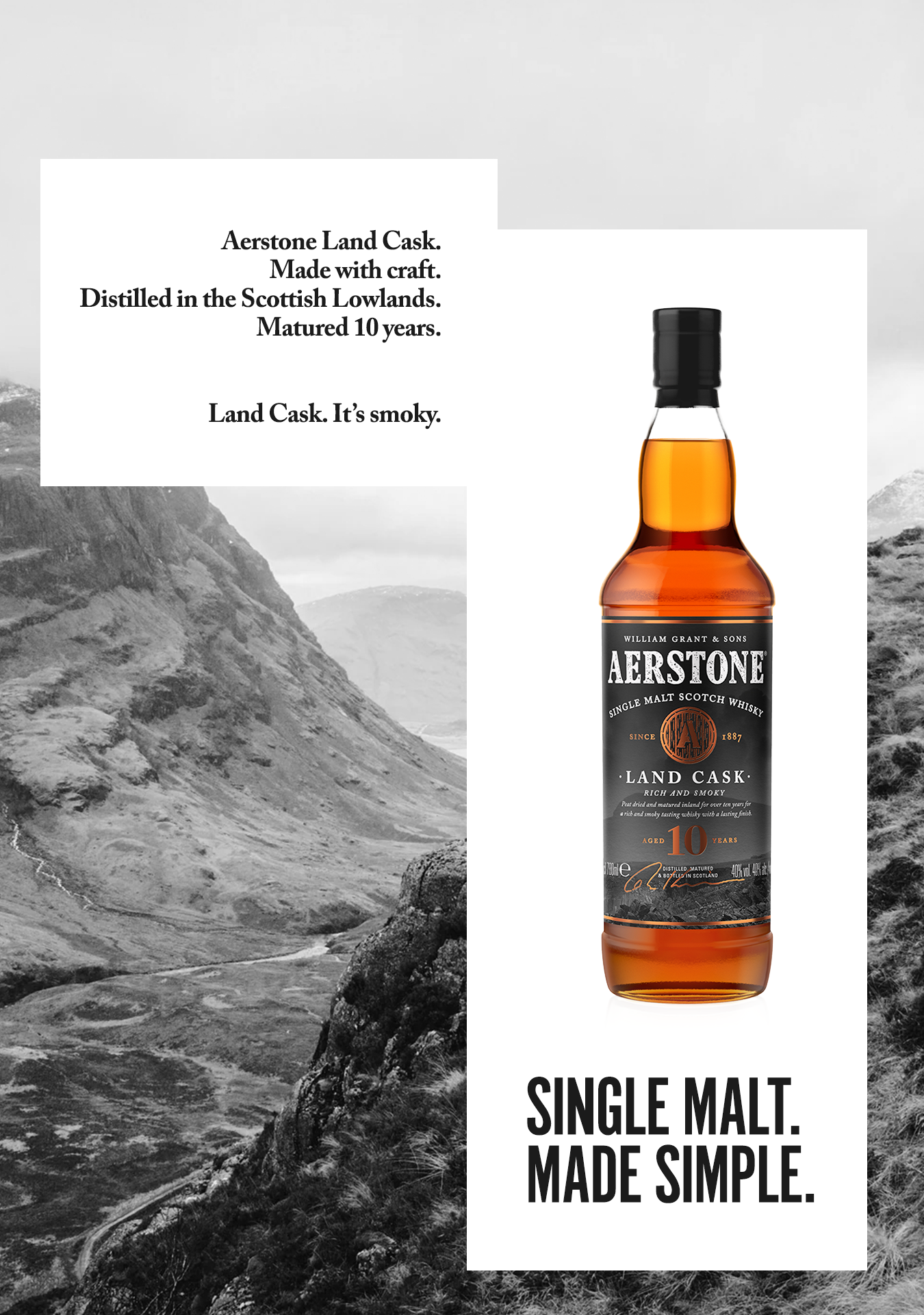
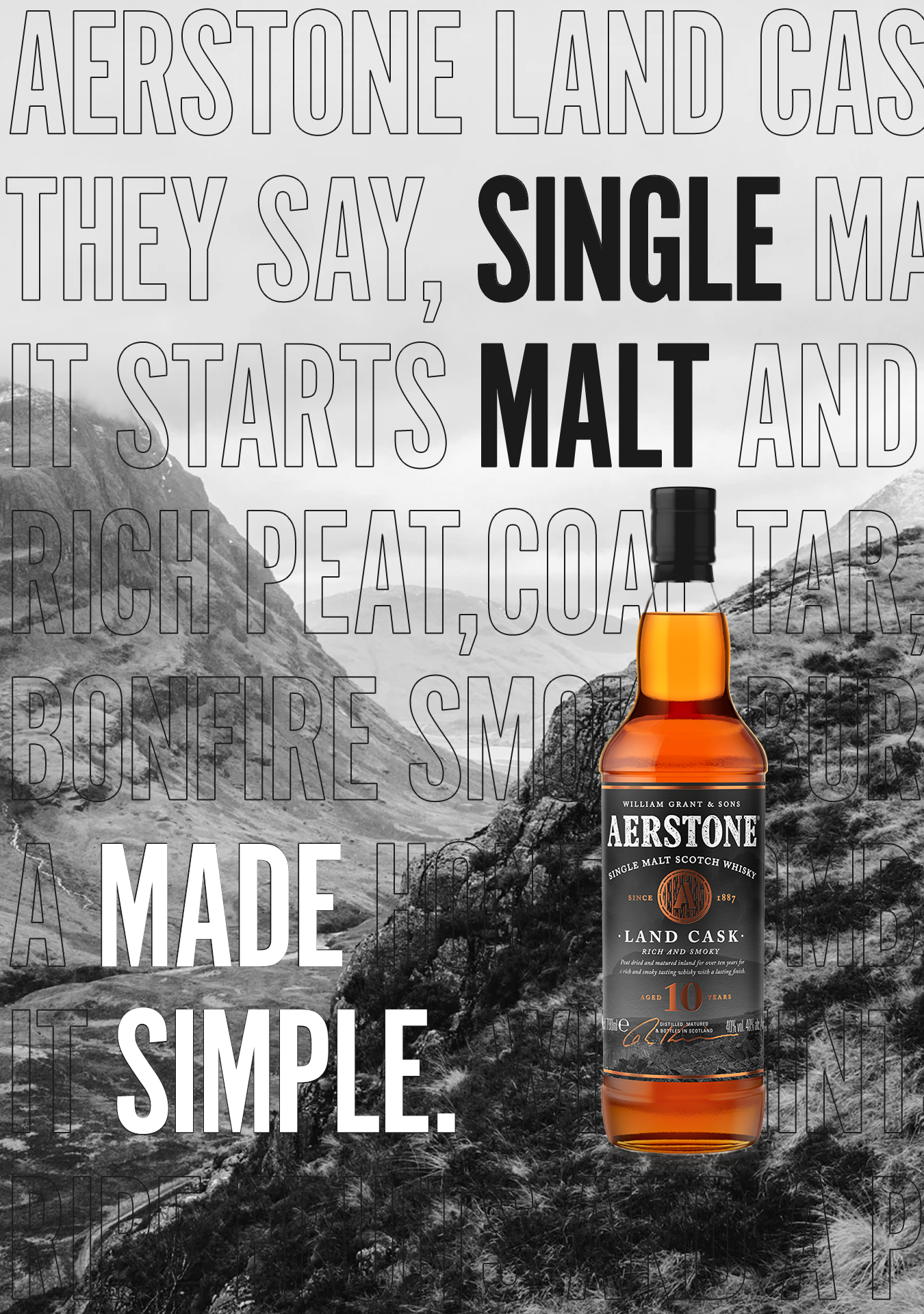
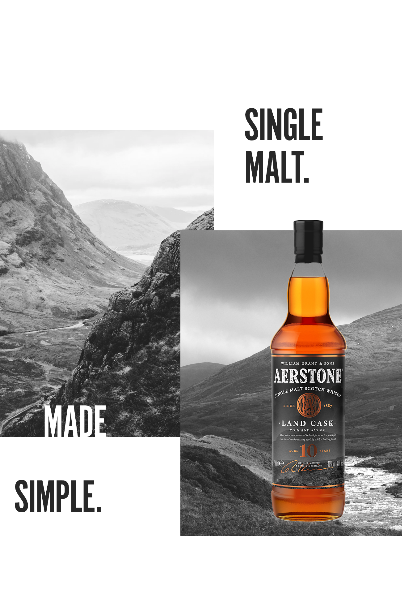
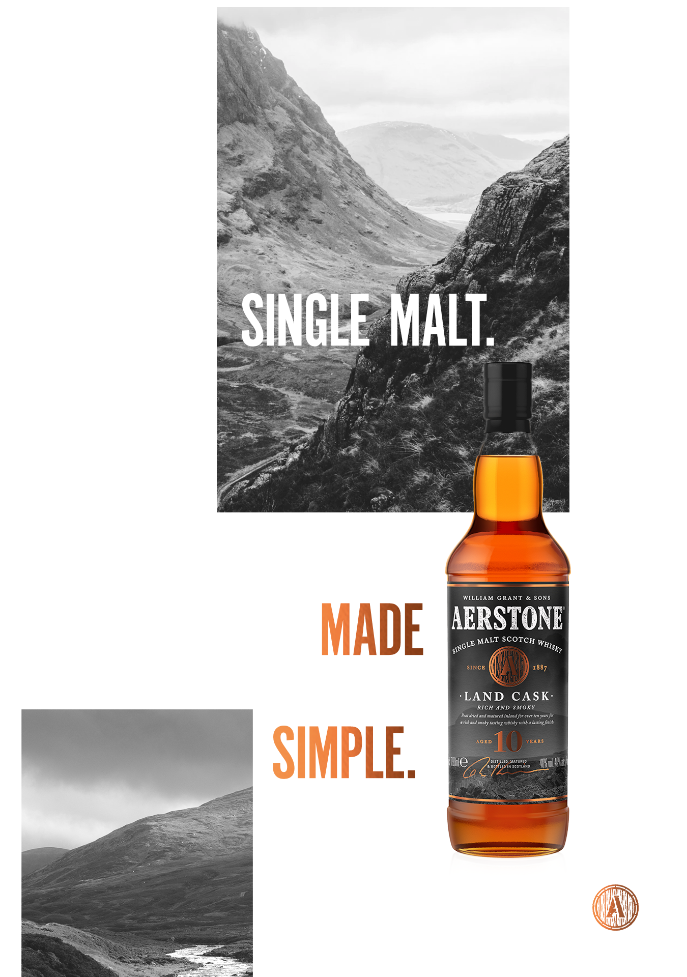
Simple doesn’t have to mean boring with layouts. By using an interesting grid system/ type with image treatment we can keep a nice amount of space and breathing room to keep it feeling simple but still interesting.
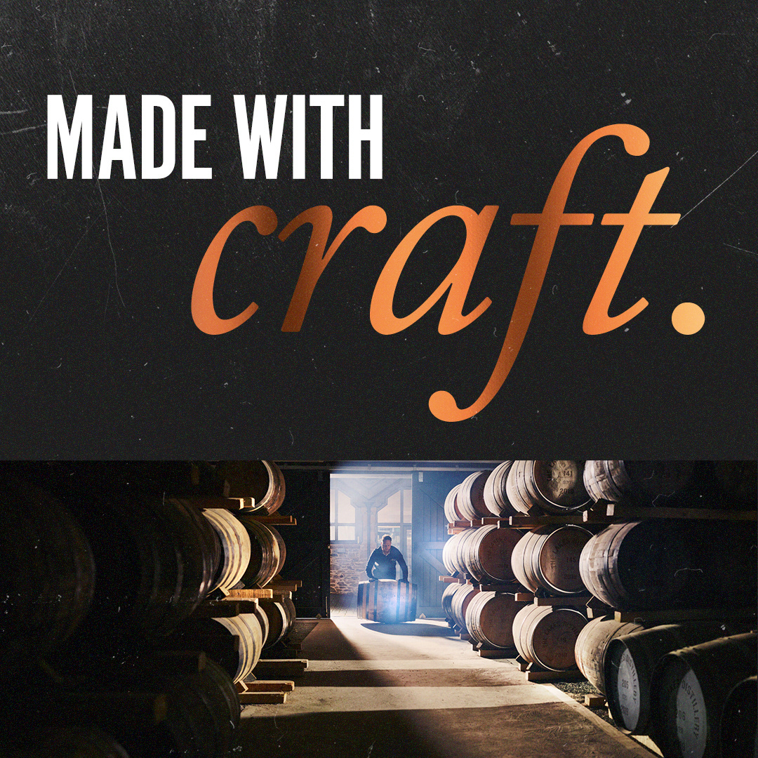
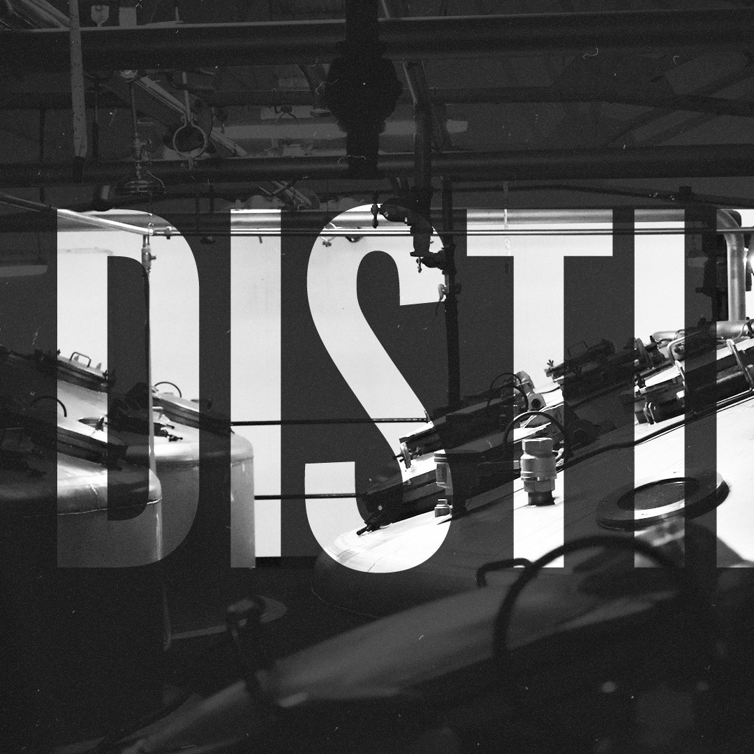
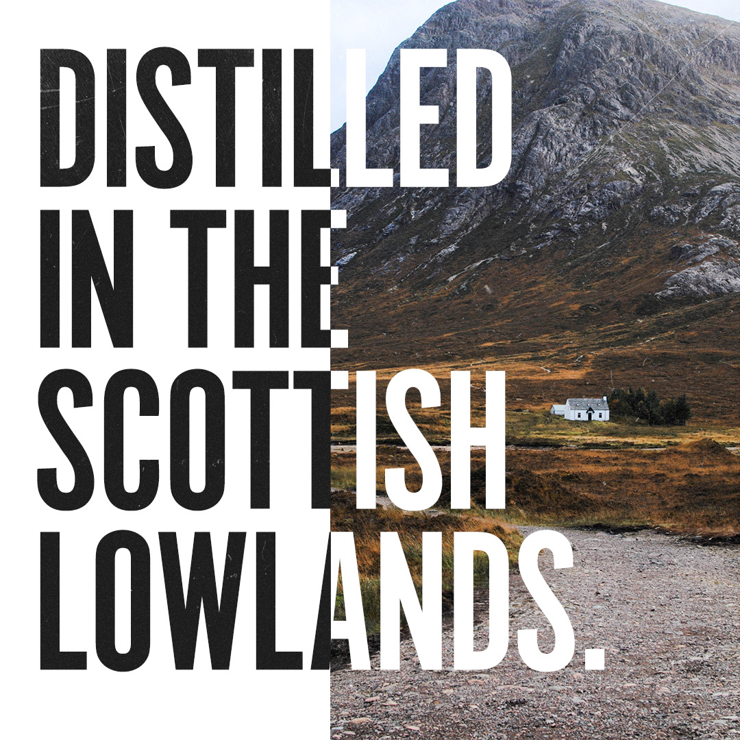
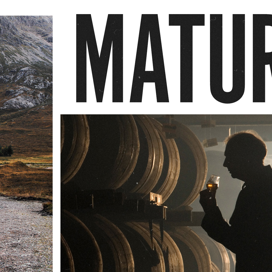
Motion design
To bring our campaign to life, I lead the team to explore how the Look and Feel could then be applied to motion social assets, using sliding windows to lead the eye and simplify the complex.
Storyboard

For final delivery we supplied a revised styleguide document, as well as in store shopper assets, social content and key visual design for print.