My role
Art Director and lead designer. Inspiring the team to make something they would be proud to showcase in their portfolios. Developing the look and feel for the campaign, pitching to the client and delivering static and motion assets.
THE BRIEF
Qmee's previous campaigns focussed on the simplicity of taking surveys - “take surveys, get paid” as their core message. But realised it isn’t cutting through the noise now everyone has gone down the same path.
They decided to re-focus on empathy, and why taking surveys and being rewarded benefits you as a person and the difference it can make in your everyday life, with a big focus on health/wellness and treating yourself to the things you want.
They decided to re-focus on empathy, and why taking surveys and being rewarded benefits you as a person and the difference it can make in your everyday life, with a big focus on health/wellness and treating yourself to the things you want.
“We are a fun brand- we take a light hearted tone with our users, and try to be very open and honest. We would rather get fewer, high quality users in than a lot of users who do not convert. Some creative works very well at hooking the user, but doesn’t get them to create an account or take a survey. We are happy to try/test new things!”
Art Direction design exploration. Using meandering ribbons or organic bubbles
to showcase the text as part of the design mechanic
to showcase the text as part of the design mechanic
As part of our retainer with Qmee, Tommy were tasked with coming up with a campaign platform to promote their surveys.
The creative team came up with two creative concepts:
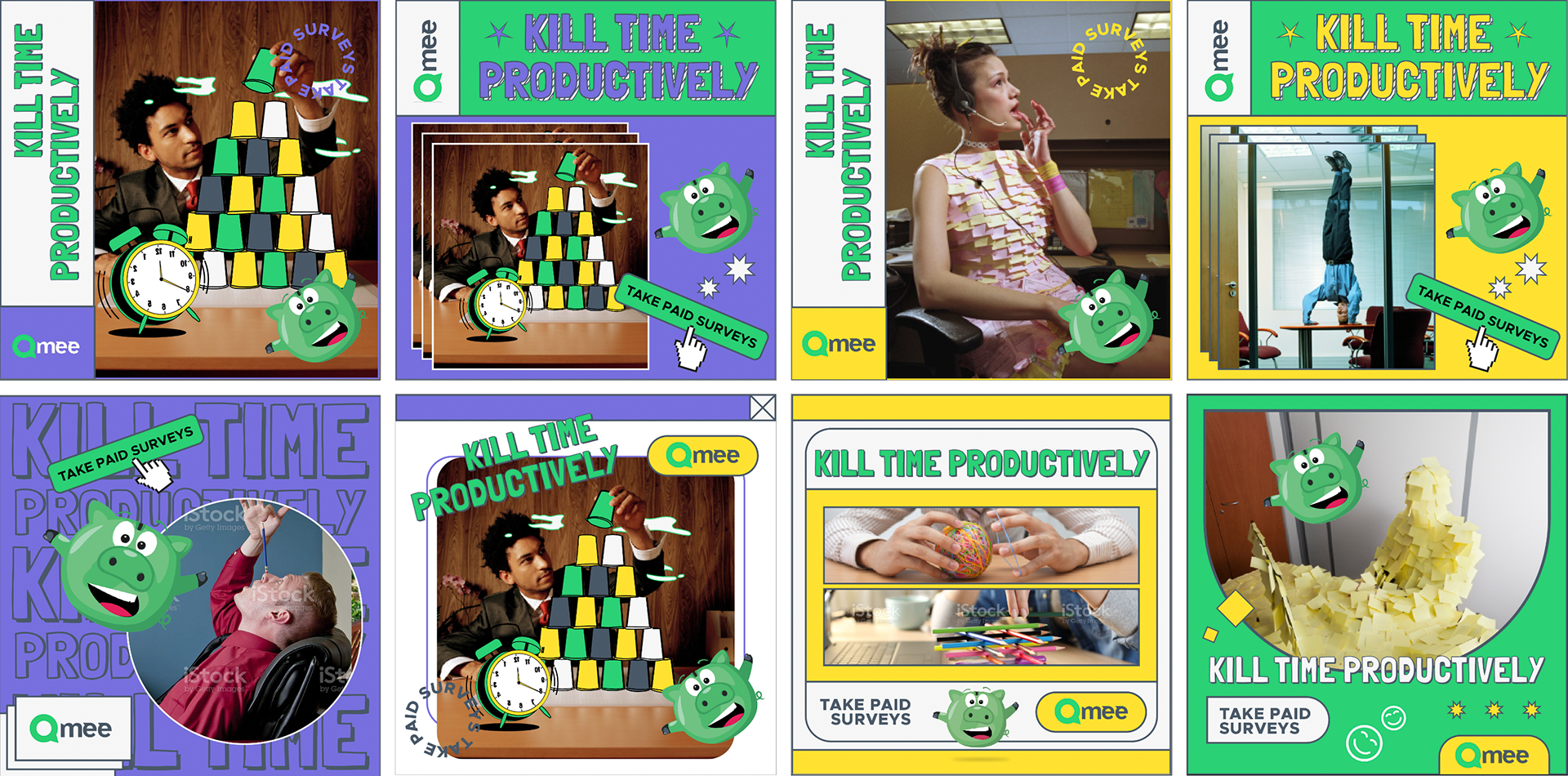
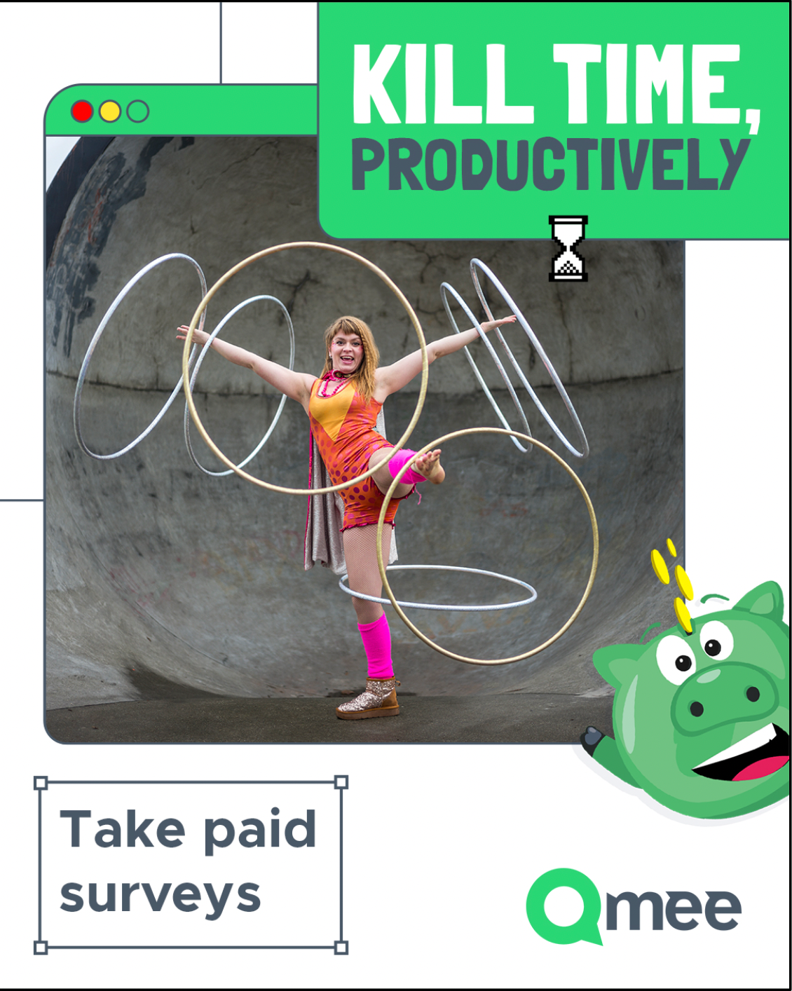
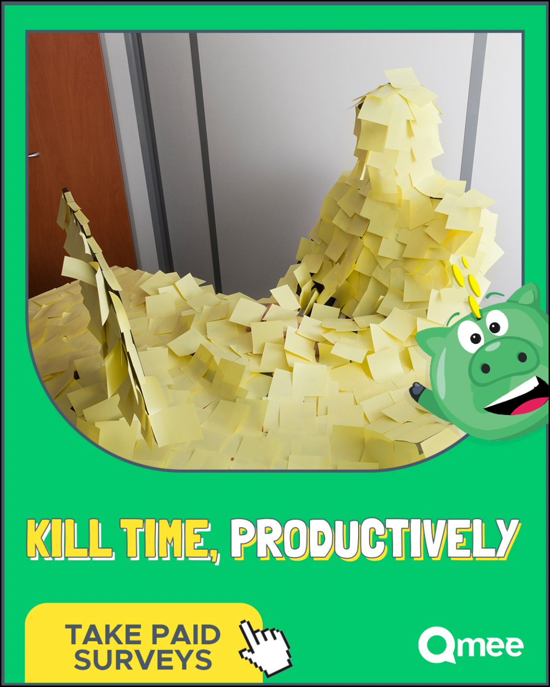
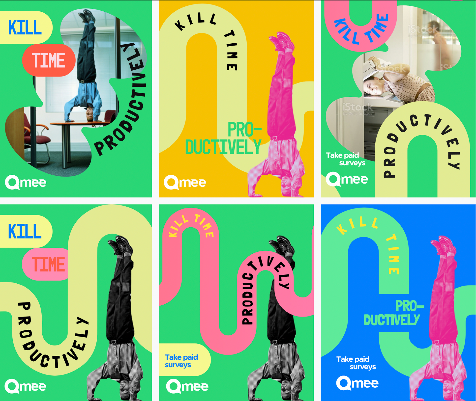
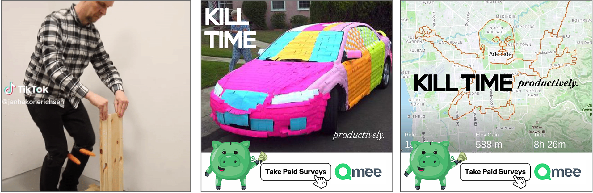
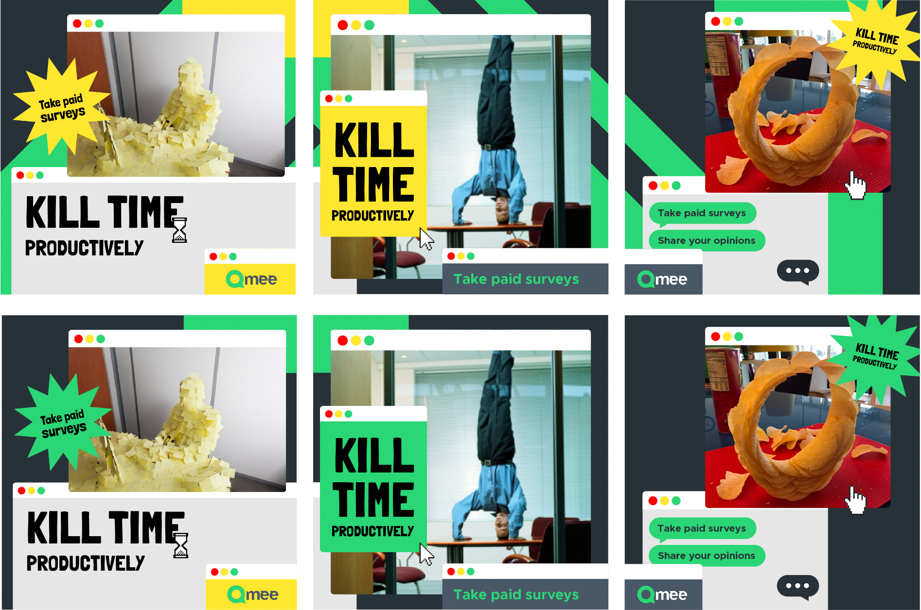
1. "Kill Time, Productively."
Swap procrastinating for something that creates change, and allows you to live better.
To demonstrate this, we’ll show ridiculous examples of procrastination, then introduce Qmee as the more productive way to spend 15 minutes. We see a few ways to execute this idea. We can source UGC that shows crazy examples of procrastination (which would be great for short TikTok style videos), and also design our own which focus on digital habits (scrolling social media, Strava stuntin’, playing candy crush etc.)
To demonstrate this, we’ll show ridiculous examples of procrastination, then introduce Qmee as the more productive way to spend 15 minutes. We see a few ways to execute this idea. We can source UGC that shows crazy examples of procrastination (which would be great for short TikTok style videos), and also design our own which focus on digital habits (scrolling social media, Strava stuntin’, playing candy crush etc.)
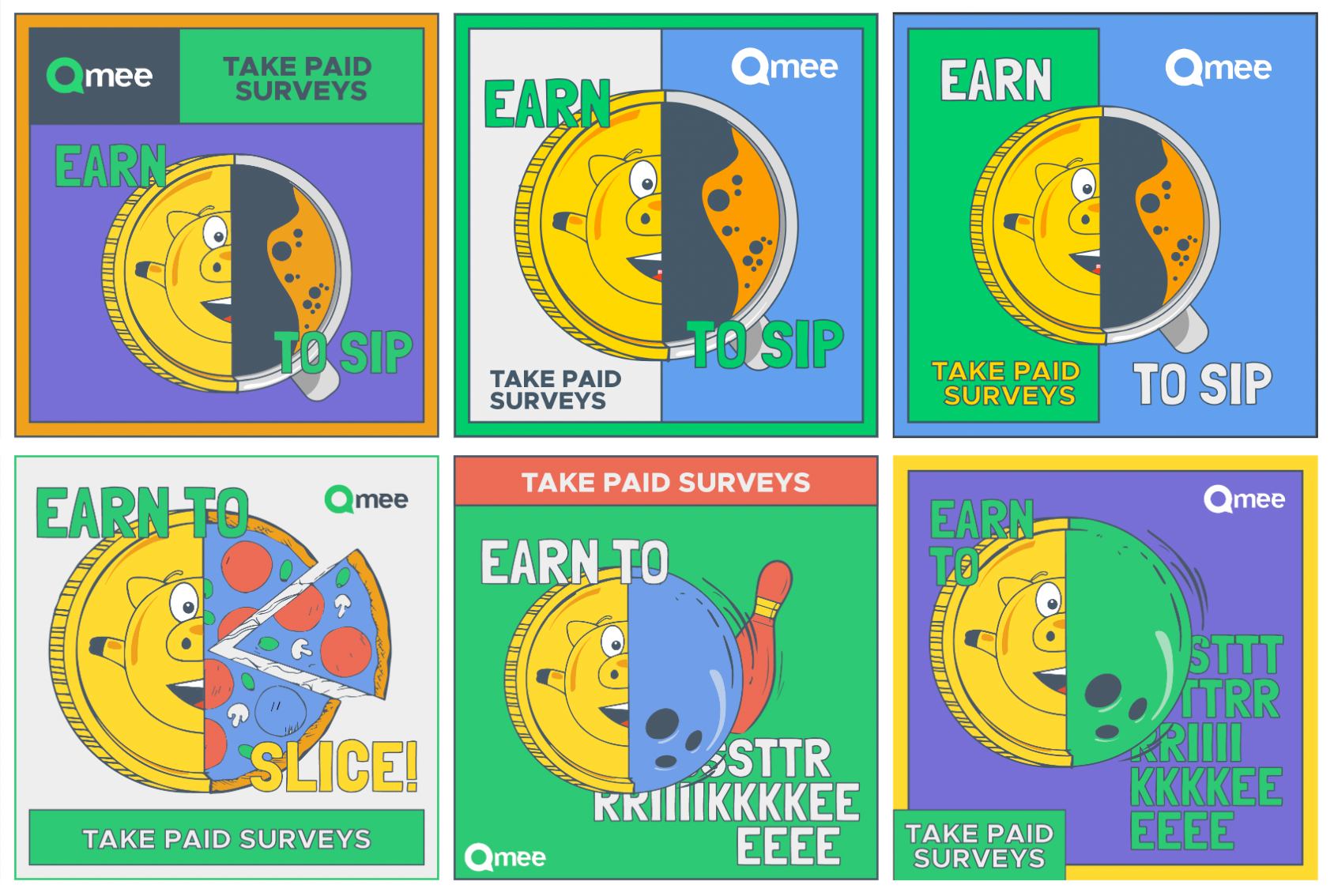
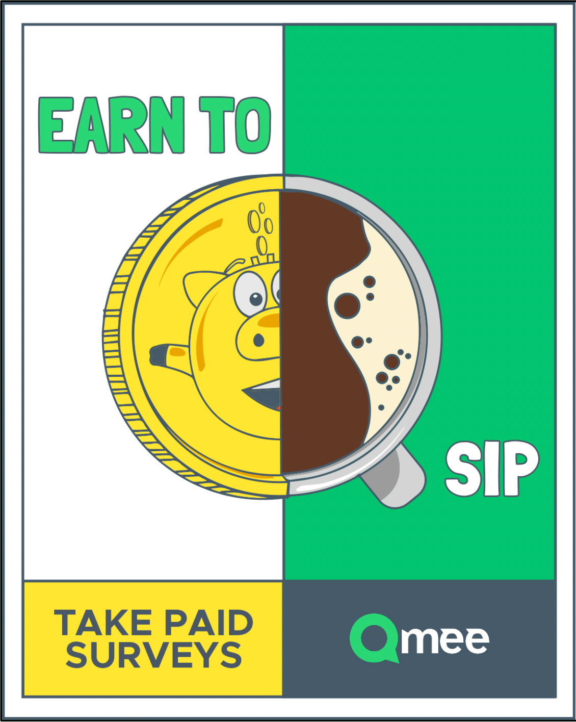
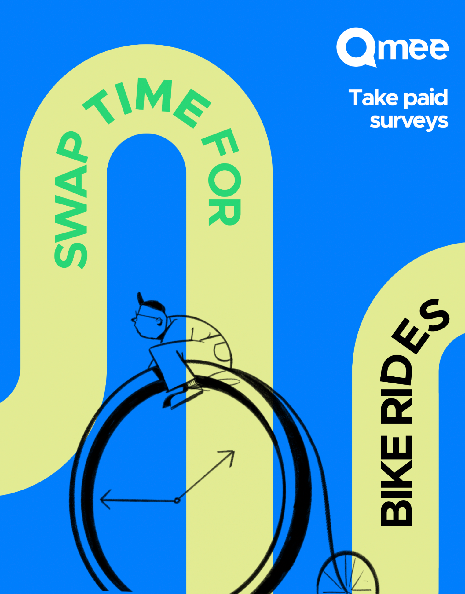
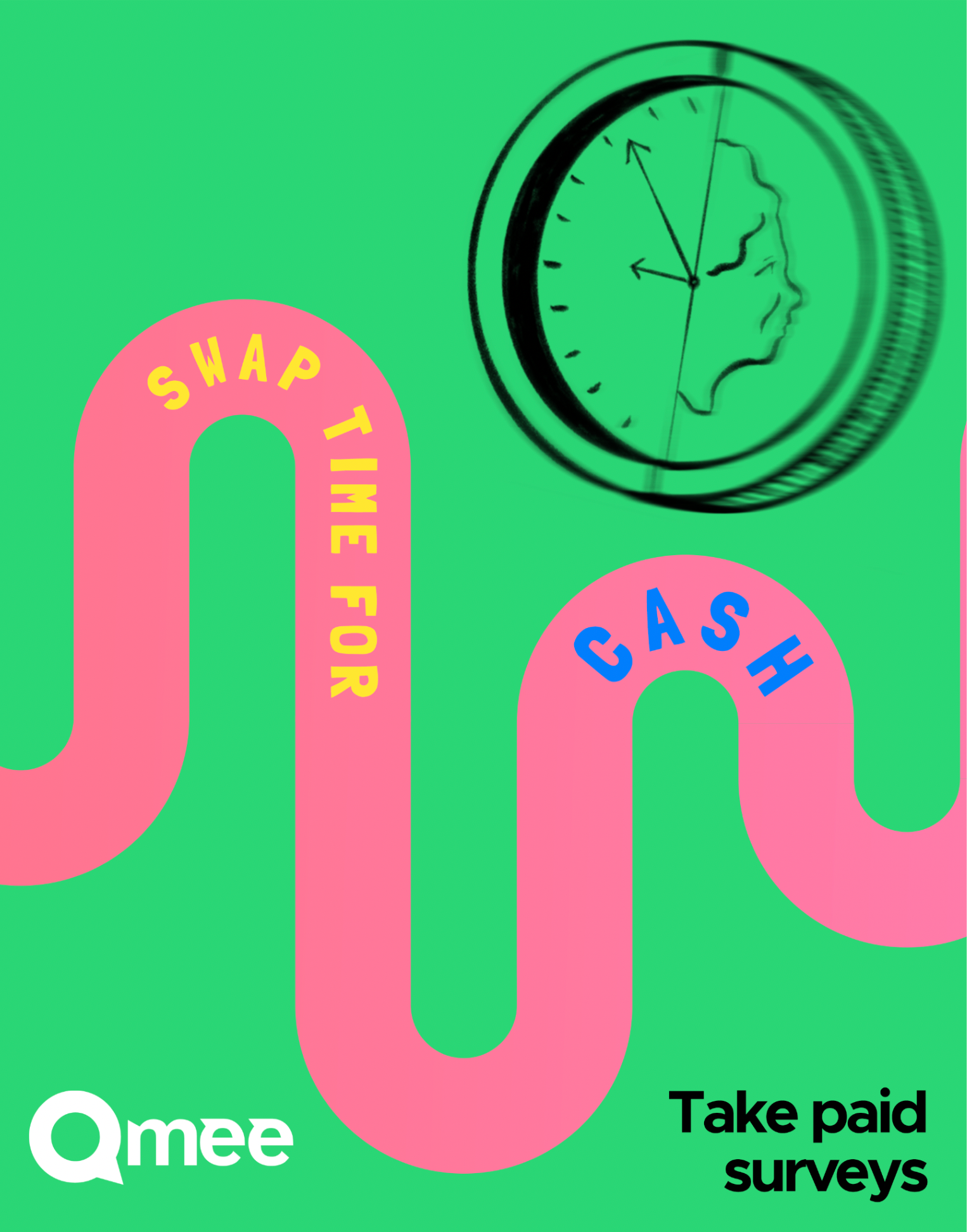
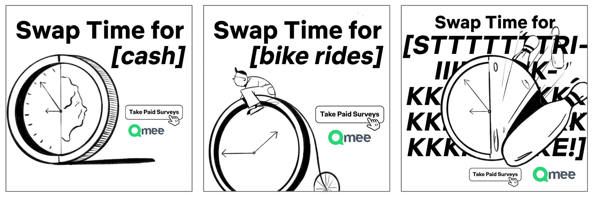
2. Swap Time for [x]
Taking a paid survey means you earn money to spend on things that benefit you.
All it requires is your time.
So to dramatise this, we wanted to visualise exactly what your time can be turned into through fun illustration.
This campaign offers a template for visuals and copy, making it easy to replicate. Visually, we reimagined what a clock can be turned into (playing into health and wellbeing imagery). Then the copy will read ‘Swap time for [insert activity]. Using illustration, we can build a recognisable world that stands out from the competition, while communicating Qmee’s fun tone of voice.
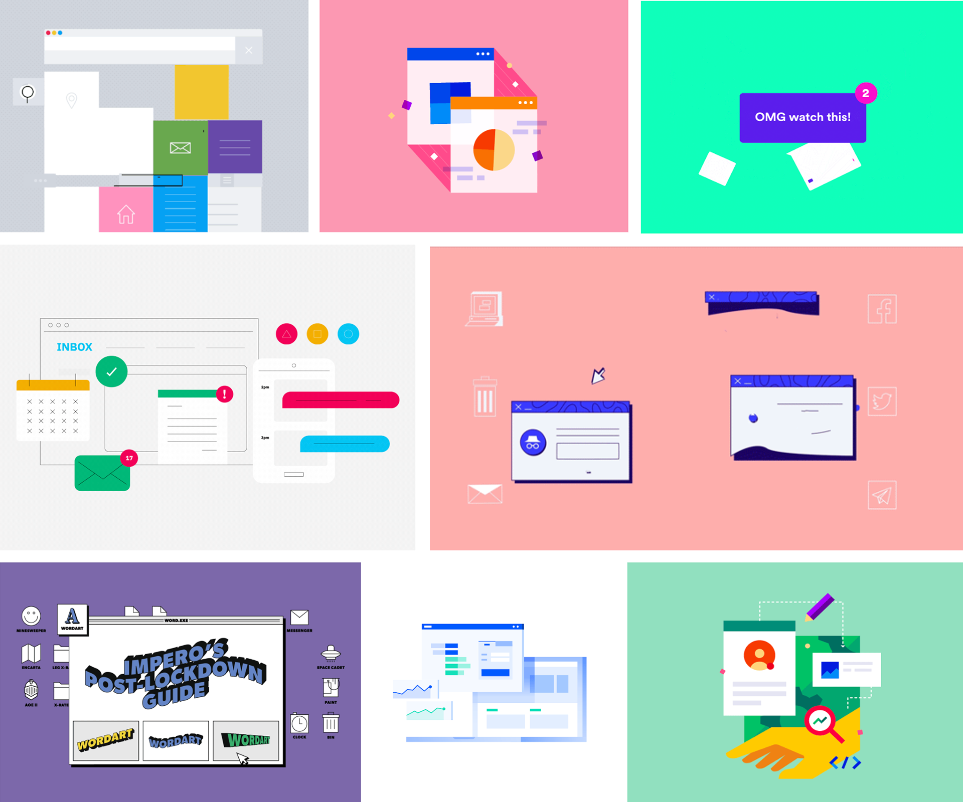
Art Direction
Qmee offered the design team an opportunity to push their branding and look and feel in a fresh direction for this campaign. We researched various themes, and landed on ‘internet culture’ and ‘browser windows’ as our overarching visuals.
Having initially pushed their brand colours to make them more exciting, the client reverted to clean and minimal colour to match their newly designed website. We developed these into motion which helped bring the whole campaign to life.
Using internet browser windows to house the content and messaging. This creates a nod to the world of online surveys, and enables us to add a playful element to the formats.
'Internet window' moodboard
We loved the idea of jumping on the internet culture trend, and create an art direction that really stands out against other online campaigns through the use of bright colours and illustration.
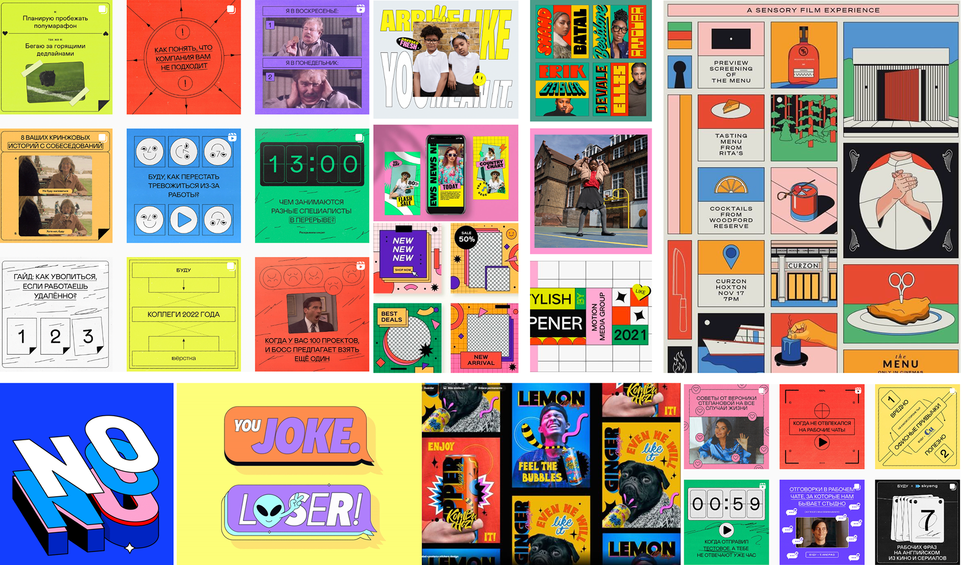
'Internet culture' moodboard