Web Design Concept
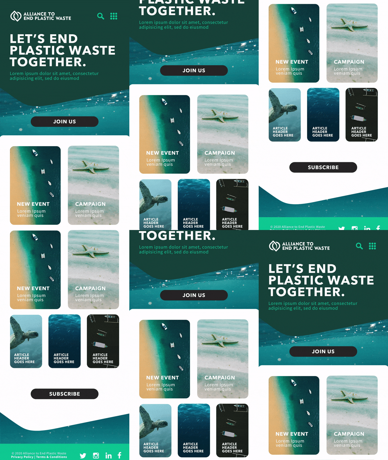
Simplifying and modernising for a good cause. I based the design on fluid shapes, inspired by the water. The rounded angles add further fluidity, paired with block colours for a more simplified modular website.
Imagery is clean and stylish, adding eye catching pops of colour to the blue tones. The modern minimalist style sets the feel of the site, and grounds the meaning behind the companies hopes and ambitions for a cleaner planet.
Imagery is clean and stylish, adding eye catching pops of colour to the blue tones. The modern minimalist style sets the feel of the site, and grounds the meaning behind the companies hopes and ambitions for a cleaner planet.
